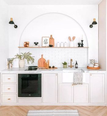
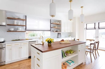
Kitchen are on of the best place in your house, it should feel comfortable and at the same time, it should look pretty. But some people overdo it, and as the result make the kitchen looks bad. Especially when it comes to a minimalist kitchen, you need to carefully think about the layout what kind of theme that you will choose. One wrong choice will lead you to a long disaster.
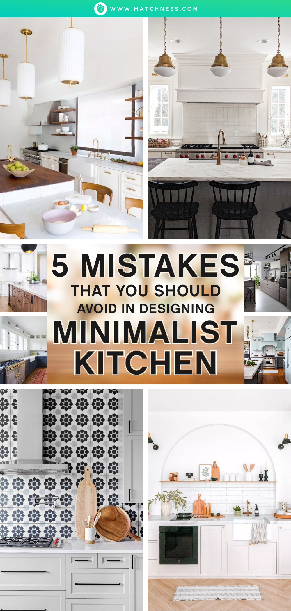
So, before you go and make your own minimalist kitchen, take a look at 5 Mistakes That You Should Avoid in Designing Minimalist Kitchen.
1. Too Much Accessories
It’s true that you need to add some accessories to make your minimalist kitchen looks pretty and bigger, but sometimes using too many accessories will make it look too crowded and make your kitchen lost its beauty.
2. Too Quick in Making Decision
You know a kitchen is a holy place in your house. You need to make it as comfortable as possible. Especially when it comes to Minimalist Kitchen, you can’t make the decision too quickly. Take some time and do your homework. After all, you don’t want to spend more money to renovate it in the near future.
3. Unfriendly Backsplashes
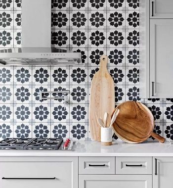
Some people choose backsplashes base on how it looks. It’s true, but you also need to see whether your backsplashes are easy to clean or not. After all, no matter how good your backsplash looks is, it will still look bad once dirt and stain accumulated on it.
4. -100% On Your Hardware
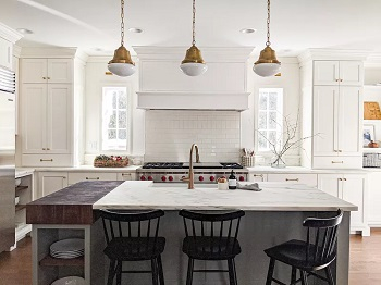
Don’t you dare to minimize the impact of your hardware or lighting just because you think it’s expansive? You can always be creative with the hardware, for example, you can express yourself through cabinet knobs, drawer pulls, or lighting.
5. Too Much Display
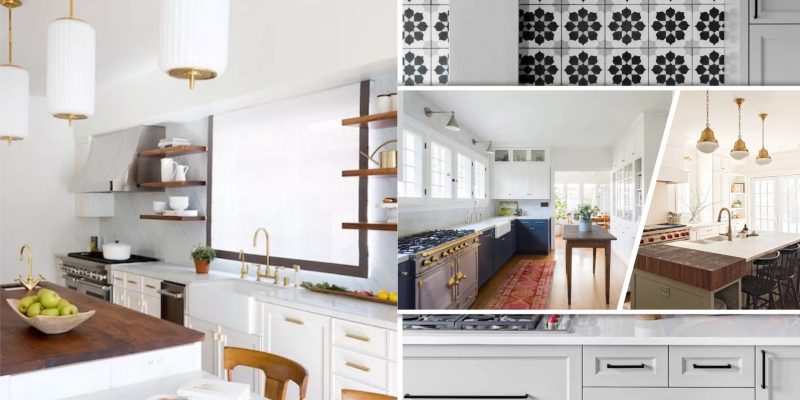
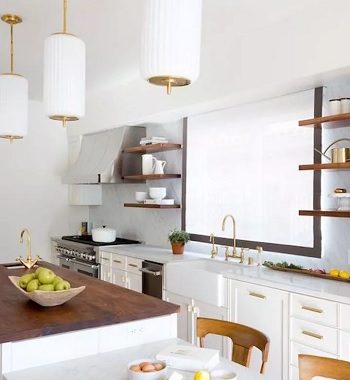
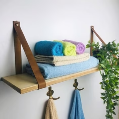
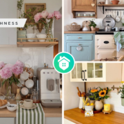
Open shelf is amazing, but too much of it will make your kitchen looks bad. Put one or two open shelves in your kitchen are enough, after all, the most important part is how you arrange the content of the open shelves themselves.


