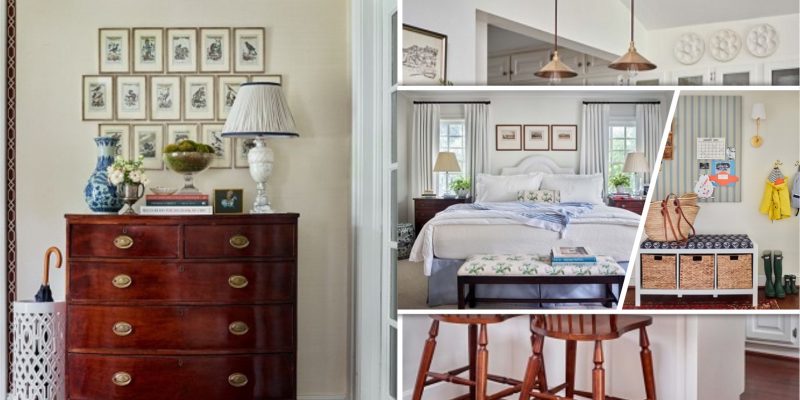
Lauren Lowe the founder of Lauren Elaine Interiors, Atlanta Designer finally have the chance to design the space based on what she loved without needing to think of her client’s opinions. She even admits that she isn’t capable to implement this design with her client. With all the ideas in mind, all that inspiration that building up inside of her, Lauren Lowe finally make her own design. Let’s take a tour and take a look at the house that she designs.
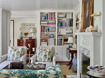
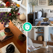
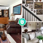
1. Living Room
This room is unique. Although the rooms feel withal a layer of vintage and contemporary items, the rooms feel modern. Lauren Lowe from Atlanta designer wants to make it looks like a more Grand Millennial Living room and not Grandma’s Living room.
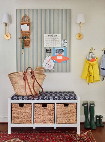
2. Mud Room
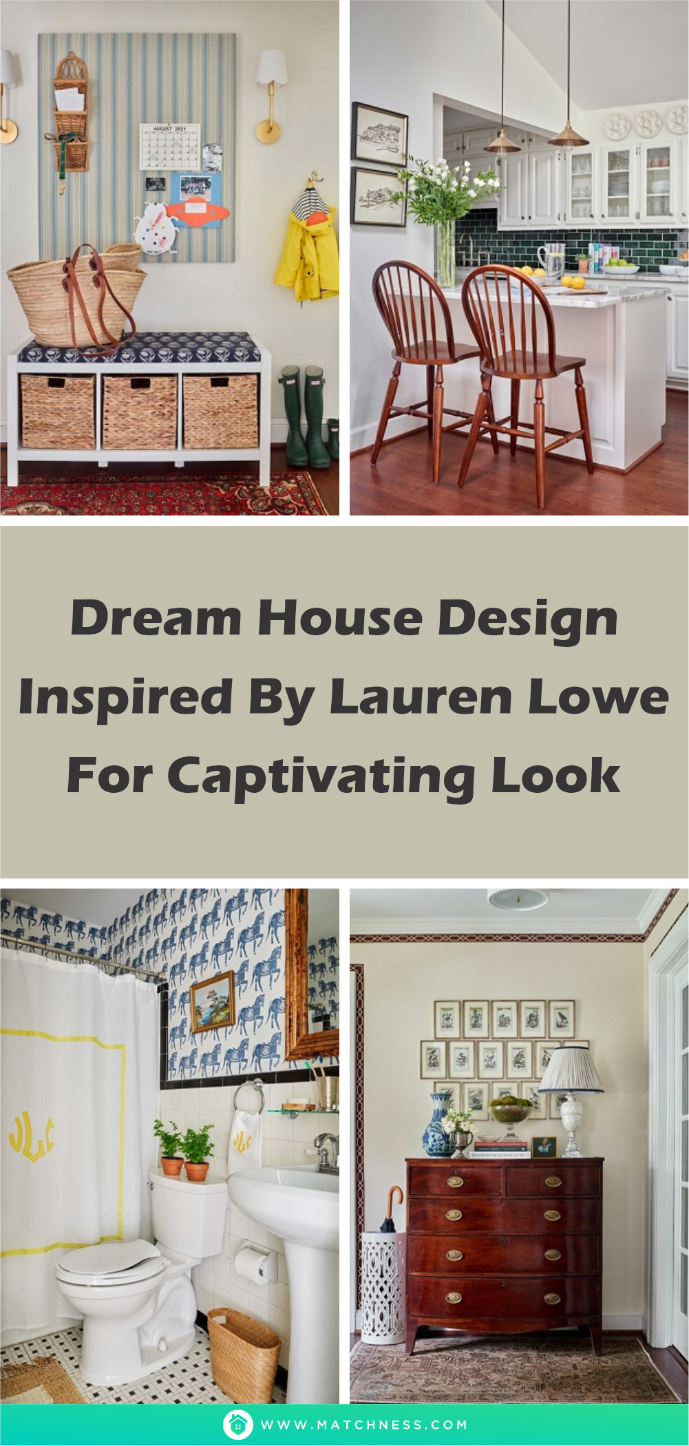
The room is close to the kitchen and the foyer. There is a striped bulletin board with a cute vestibule that makes the room memorable and eye-catchy.
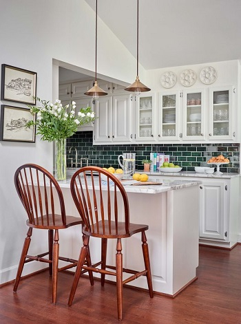
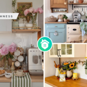
3. Kitchen
For the countertop, Lowe looked into 100 slabs from Calacatta Marble. She wants the best of the best for the kitchen, “I’m the pickiest Client” Lowe says while joking. The semi-transparent glass cabinet makes the kitchen looks gorgeous and beautiful.
4. Dining Room
Since the room didn’t have any windows, then the arrangement need to be bright. And in this case, she decided to use bright and fun wallpaper combined with softer blue color and bright white for the wall, it makes a perfect combination for the rooms. The Dining room is designed to work for all occasions since the house didn’t have a breakfast room.
5. Foyer
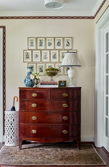
Although Foyer is a typical design for the house in the neighborhood, Lowe made some changes that make it unique. Using an animal engraving with some grasscloth with heavily textured, she made an amazing foyer that perfects the home design.
6. Primary Bedroom
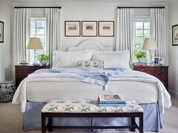
The room was designed to look as simple as it could and used white color for the paint which makes the room brighter and feels wider. The symmetries window on each side of the bed makes the rooms look pretty and perfect.
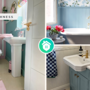
7. Kid’s Bathroom
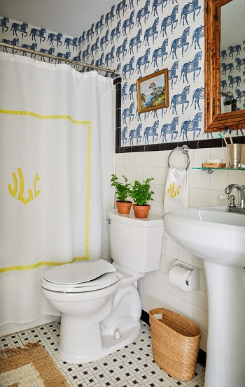
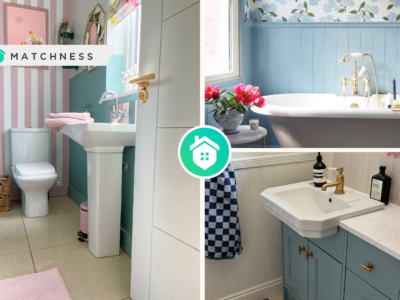
Nothing particular in the design of this bathroom. the horse print on the wall is because Lowe really loves horses. Lowe also put many ideas and treasures from her childhood and make them all the way into her children’s bathroom.


