Designing a kitchen is quite tricky, while it needs enough space, it also needs to have a good arrangement so it will not look crowded and dirty. While it is tricky to design, there are also lots of designs out there by experts that you can look at and be inspired by it. Just like how Betty Crocker and Claude Monet designed a kitchen for their client. Take a look at how they transform the kitchen and maybe you can get more inspiration from it.
1. Sink
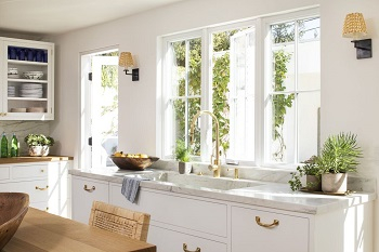
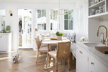
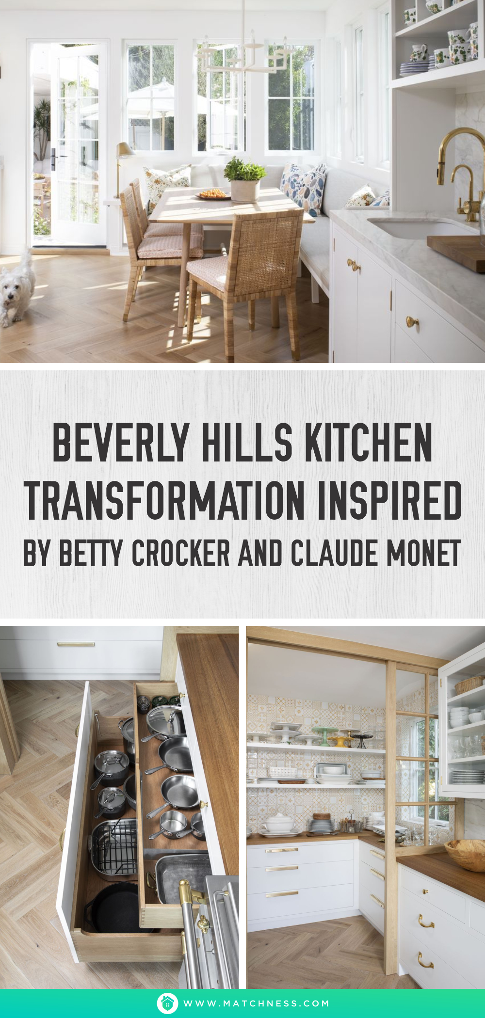
We love how the sink is integrated with marble, it looks gorgeous and luxe. The Brass Faucet from Waterstone Faucets complements the looks and makes it feel modern yet vintage at the same time. We also love how the sink is put near the window, the sunlight leak from the backyard makes it feel comfortable and calming. Moreover, you can also see the kids playing in the backyard, which makes the overall look feel perfect.
2. Range
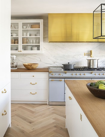
To make the design have more dimension, the owner use an unlacquered brass hood from Modern-Aire Ventilating, Inc. Moreover, the brass color makes it look warm and luxe. It also matches very well with the faucet in the sink. The baby blue Lacanche range makes it look fun and entertaining.
3. Pantry
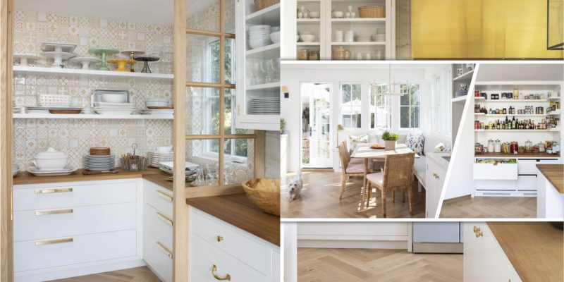
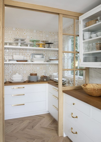
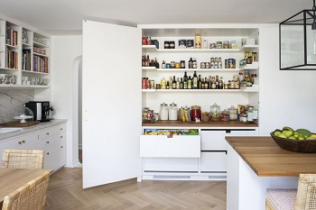
The tile in the pantry wall is actually handmade by Hart & Toth Cabinet Co. the tile is inspired by Monet’s Kitchen. Not only does the tile add dimension to the pantry, but it also adds a pattern to the pantry. The brass cabinet is also the creation of Hart & Toth Cabinet Co., it gives a sense of luxe and makes the kitchen look perfect.
4. Nook
With an additional space in the kitchen, the owner decides to make it a nook for family breakfast. The rattan chair makes it look vintage and cool while the sofa adds a modern touch to the nook. When both combined together, it made a perfect combination for the kitchen’s overall looks.
5. Storage
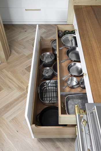
This is the most important part of the kitchen, the storage has an important role. It keeps a lot of stuff such as spices, kitchenware, and many others clean and neat. The storage is quite tricky because if you arrange it wrongly, it will affect the overall looks of the kitchen.


