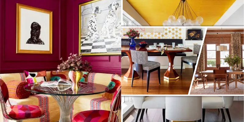
The dining room is not only about the dining tables or chairs, but all furniture and colors in the dining room will also have a bigger impact. We need to carefully consider the color arrangement, wallpaper, mural, and other things so it will not affect the overall look of the dining room, and most importantly it will not make the dining room feel crowded. Take a look at how designers around the world arrange the dining room and make it feel inviting and warm.
Dining Room into Tasting Room
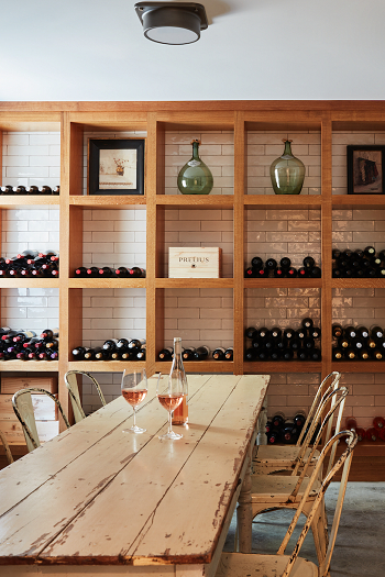
This dining room has a double purpose, first for eating your meal, and second for wine storage. The cubbies in the wall are built-in and are suitable for keeping your wine safe.
Play with Texture
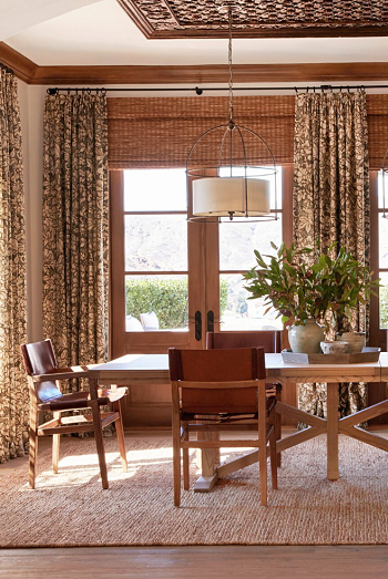
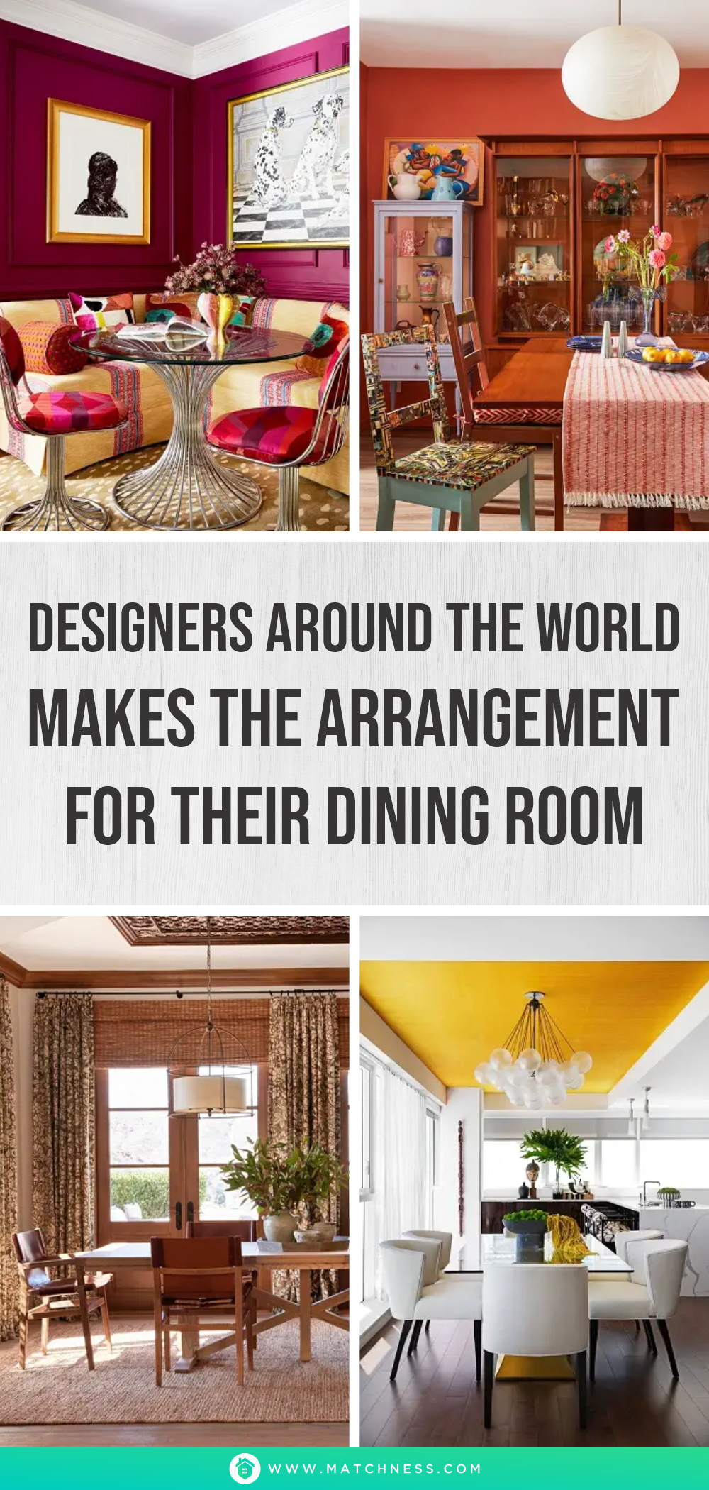
Interior Archaeology arranges the texture for the Dining Room with a handwoven rug and wicker roman shades, with this arrangement the room feels warmer and comfy. Interior Archaeology also uses neutral colors and wood accents with simple patterns for the curtain to make the room look simple yet elegant.
It’s All About Trim
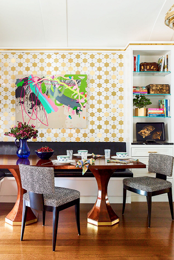
This room features gold trim that wraps around the room and by doing this the gold trim will mimic the gold accent along the dining table which enhances the overall look of the room. In this design by Cullman & Kravis, we can see that trim can instantly upgrade and enhance the space.
Unexpected Detail
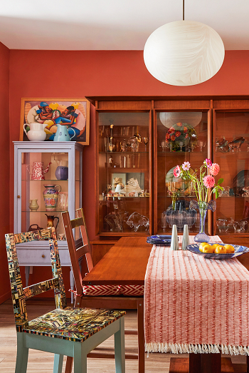
If you look closely at the picture, the mismatched chair of the dining table and a mural that plays along the burnt orange walls make the room livelier and more fun. The design by Keita Turner makes the Dining Room in this Brooklyn Apartment become the best design this year.
Built-in Screen
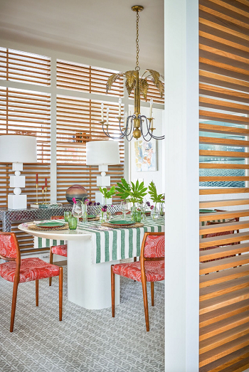
If you are thinking of making a room divider, then you should also think about this idea. The louvered oak panels designed by Barrie Benson not only separate the room but also welcome the airflow and the light to your dining room.
Balancing the Warmth with Formality
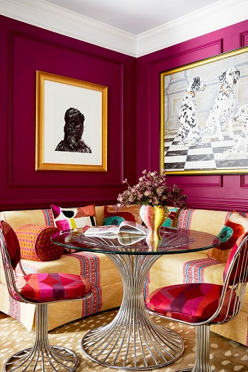
The nook looks small for a dining room, but if you look carefully this nook is comfy and cozy enough to enjoy your meal. Moreover, although the nook looks tailored, it is still approachable and inviting.
Zone Separation
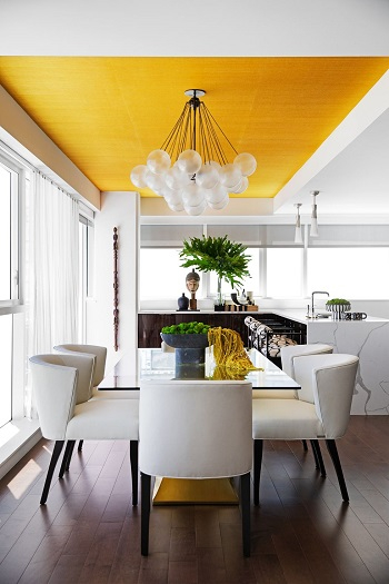
In this design, by Halden Interiors the kitchen and the dining room are connected to one another, but by adding a sunny shade wallpaper on the ceiling, the rooms are now separated but still connected.


