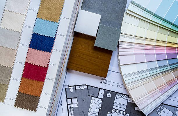
Let’s embark on a thrilling design adventure! Decorating a home transforms a physical space and the energy within it. It’s a task that breathes life into a home, filling it with personal style and charm. A suitable colour scheme can make all the difference in the world. So how do you craft this colour palette?
Unlocking the Power of Colour
Understanding colour theory is paramount. It’s all about how different colours interact and how they can evoke specific emotions. Warm hues like reds and yellows radiate energy and excitement, while cool blues and greens inspire tranquility. The more you comprehend the psychology of colour, the more effective the colour scheme will be.
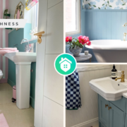
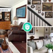
An excellent strategy is to consider how to use dark coloured wallpaper. Dark hues can add depth and sophistication to a room, but balancing them out is crucial to avoid a gloomy feel. Contrasting them with lighter furnishings or incorporating splashes of vibrant hues can create a dynamic, stylish environment. This careful blend of dark and light, colour and shade, can turn your interior into art.
The 60-30-10 Rule
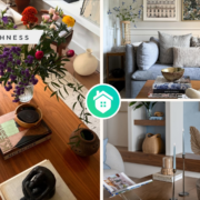
Rules aren’t set in stone in interior design – they’re more like guidelines, but the 60-30-10 rule is worth noting. With this rule, 60% of the room should be a dominant colour, 30% a secondary colour, and 10% an accent colour. This balance helps to harmonise the different hues in a space, creating a visually appealing look. It’s not a strict rule but a helpful guide when you’re in a design difficulty.
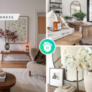
Choosing a Base Colour
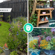
For a serene bedroom retreat, consider cool blues or soft greens. Are you seeking a lively living room vibe? Consider oranges or warm yellows.
Complementing Your Base
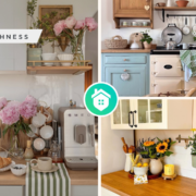
After settling on a base colour, the next step is to find complementary or analogous colours. Complementary colours sit opposite each other on the colour wheel, creating a vibrant contrast when paired. In contrast, similar colours sit next to each other on the wheel and offer a more harmonious feel. These shades will form the rest of your 60-30-10 ratio, supporting and enhancing your base colour.
Don’t Forget the Neutrals
While experimenting with a rainbow of possibilities, remember to invite neutrals to the party. These are your whites, greys, beiges, and blacks. In your scheme, they can be used as a base, secondary, or accent shade. Neutrals provide balance and allow brighter colours to shine without becoming overwhelming. They’re the unsung heroes of interior design, the perfect wingmen for your more striking hues.
Diving Deeper into Colour Theory
Colour theory is a vast ocean of knowledge waiting to be explored. It doesn’t just stop at the emotional connotations of different hues. Oh no, there’s much more to it. It also encompasses understanding concepts like hue, saturation, and brightness. Hue refers to the actual colour on the spectrum, while saturation relates to the colour’s purity or intensity. As you might guess, brightness refers to how light or dark the colour is. By comprehending these aspects, you can manipulate them to achieve the desired impact in your interior design.
Furthermore, colour schemes aren’t limited to complementary and analogous patterns. There are other intriguing options like triadic and split-complementary schemes. Triadic colour schemes use three colours equally spaced around the colour wheel, offering a balanced but vibrant look. On the other hand, split-complementary schemes use a base colour and two colours adjacent to its complement, offering high contrast without the strong tension of the complementary scheme.
Perfecting the Art of Using Dark-Coloured Wallpaper
The artful use of dark-coloured wallpaper is a growing trend in interior design. When done right, it can give a room an air of elegance and sophistication. However, it’s more complex than slapping up some dark wallpaper and calling it a day. There’s a careful balancing act involved. To prevent the room from feeling cave-like, creating contrast with lighter or brighter elements is crucial. This could be a piece of artwork with vibrant hues, a light-coloured piece of furniture, or even metallic accents which reflect light and add a dash of glamour.
Navigating the 60-30-10 Rule
The 60-30-10 rule, while sounding mathematical, is a valuable guide for creating a harmonious colour scheme. It ensures that the colours in a room are balanced and visually appealing. The 60% portion sets the overall tone of the room. This somewhat neutral or muted colour acts as a calming backdrop for the rest of the colours. The 30% offers some contrast, and the 10% is the jewel in the crown, that spark of excitement that brings the room to life. The trick here is to ensure that all three components play well together. They should all be different enough to offer visual interest but not so different that they clash.
Conclusion
Creating a colour scheme for your interior design can seem daunting at first glance, but it’s a thrilling, rewarding process. Anyone can craft a beautiful, harmonious colour scheme by understanding colour theory, employing strategies like the 60-30-10 rule, and being mindful of how different hues interact. So, why not start today and paint a new story in your home?