Talking about the eclectic design, it will be about the mix and match of some decoration techniques. It will be interesting because you can get what you really want for your home decoration. Well, it can’t be doubted that we don’t feel satisfied with only one decoration style. Or, we are confused about deciding the style that we want to apply the most. Only applying one style feels like can’t represent your imagination of the house version that you want. Here, applying the eclectic decoration style is the best thing you can do.
Basically, there are some kinds of mixing and matching techniques that you can do for eclectic decor, those are
- Mixing different decoration styles
- Mixing different eras
- Mixing different colors
- Mixing different materials
- Mixing different patterns
- Mixing different textures
From all of those choices, if you want the simple one, you can do the color mixing. It is really common and quite easy to do. However, of course, you still need to find the right color to be mixed. You should be able to know well about the color tones so that you won’t do the wrong color mixing and ruin the decoration impression.
To do the color mixing for your eclectic decoration, we advise you to find the color scheme first. It means that you should decide the main or the dominating color to be made as the concept of the decoration. With this, the decoration won’t be seen as random and complicated. After you find the right color scheme, you can then decide on the shades or tones that fit the color scheme you choose. You’ll find it easier by using this technique to do the color mixing. Here we have prepared some colorful eclectic decoration ideas to be your reference.
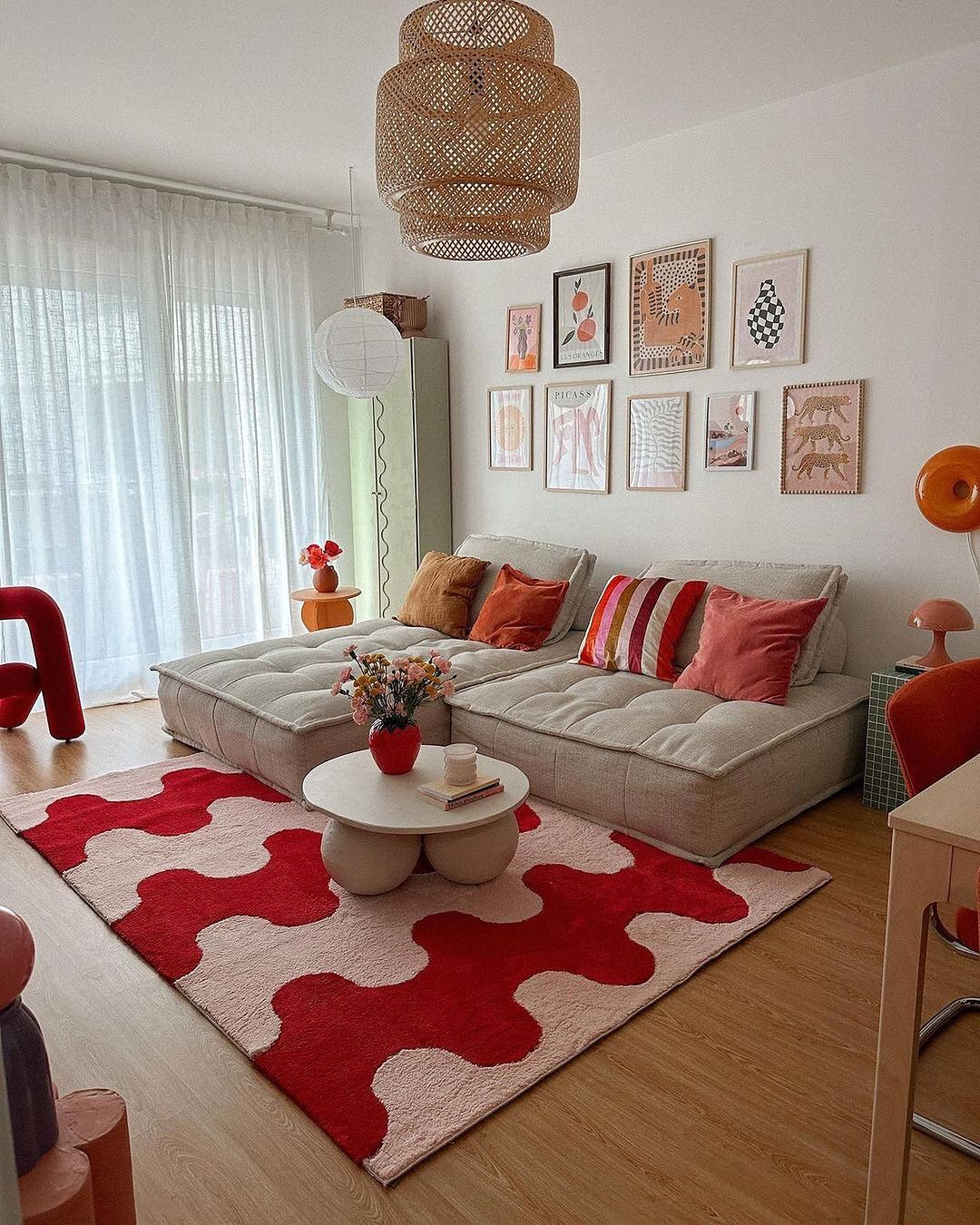
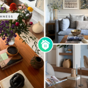
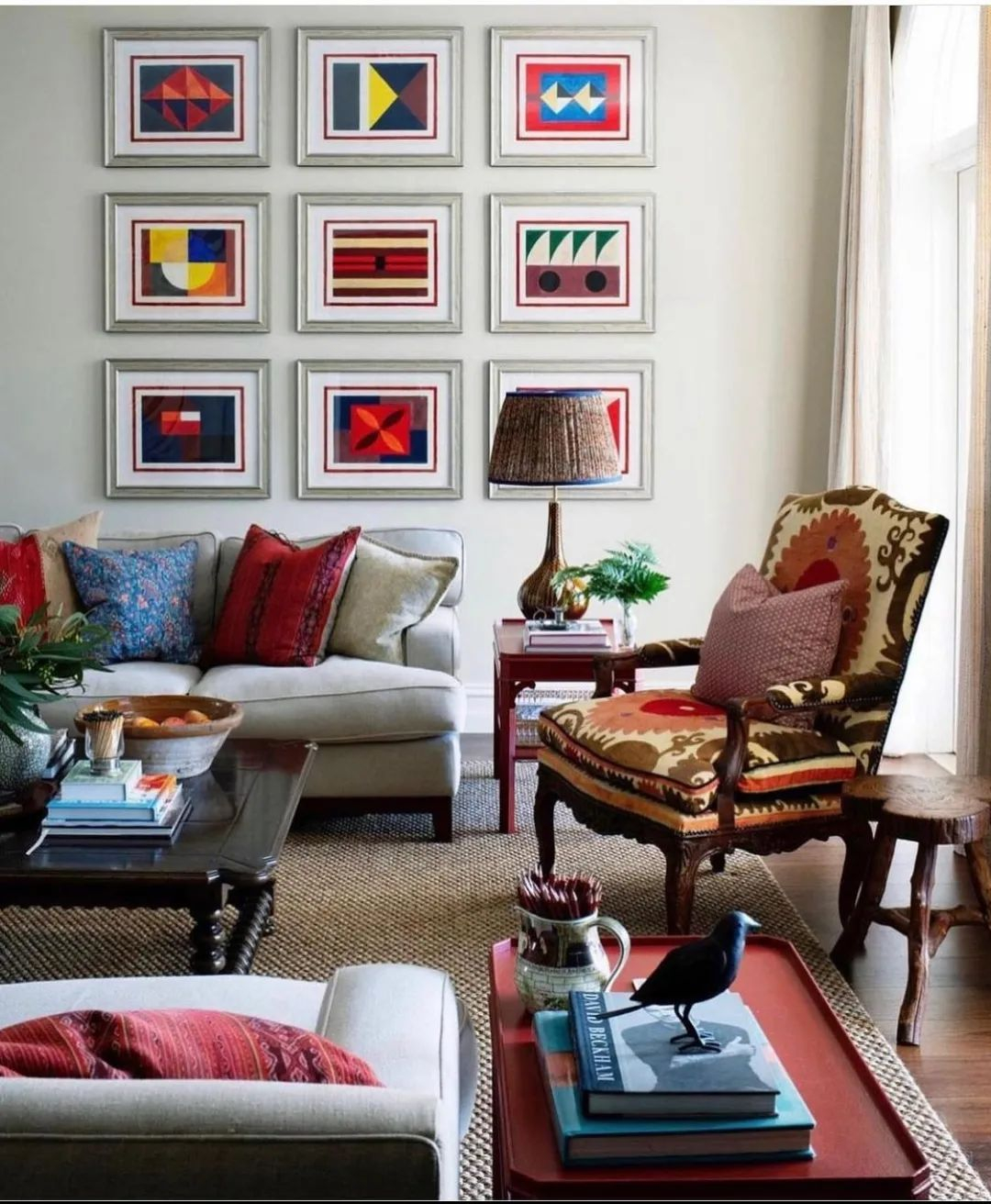
The main color of this eclectic decoration is the red color. It is then combined with the pink color which will be really match since the pink color comes from the red color as the basic tone. The pink color can also be used to tone down the red color so as not too stand out. There is also a brown color that functions to create a warm atmosphere and a white color to neutralize the decoration impression. Pretty Red Shade from @perfetehome
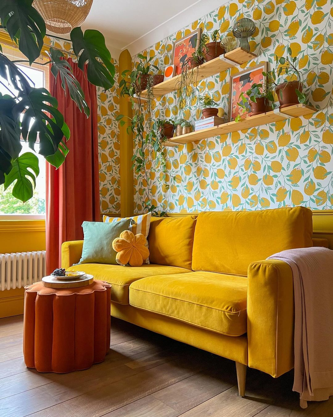
Look at how fresh this decoration looks like. It feels like summer as it can be the best recommendation for your summer home. The main color is yellow which can be seen on the sofa. Then, it is paired with the yellow wallpaper in an orange pattern that becomes the key to the fresh impression this decoration has. The yellow color was then mixed with the red color and pink. Then, finished with the brown floor color. Fresh Yellow Shade from @thistimeincolour
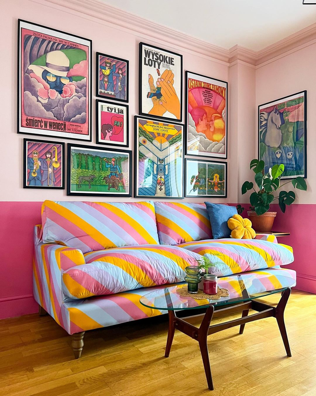
Fun is the impression of this eclectic decoration. It has massive colors mixed in a retro style that will be great for youngsters. The color scheme of this decoration is pink which is applied to the wall as the color dominates in two different shades, the bold one and the soft one. Retro Color Scheme from @thistimeincolour
The color combination of this decoration is not being applied to the main parts of the room. It is more focused on the carpet in an aesthetic pattern with some color combinations. Then, to strengthen the eclectic decoration impression, the room is added with an orange chair, yellow throw blanket and cushion, and the paintings with color combination. Warm Color Combination from @restyleart
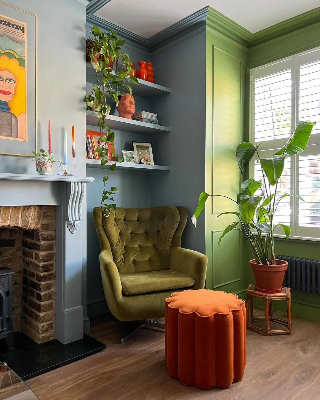
Look at how fresh and calming this decoration can be. The green color is applied in different shades that come on the chair, part of the wall, and greeneries. It is then mixed with the blue and orange color that is really contrast but can complete each other really well. Fresh Green Decor from @thistimeincolour
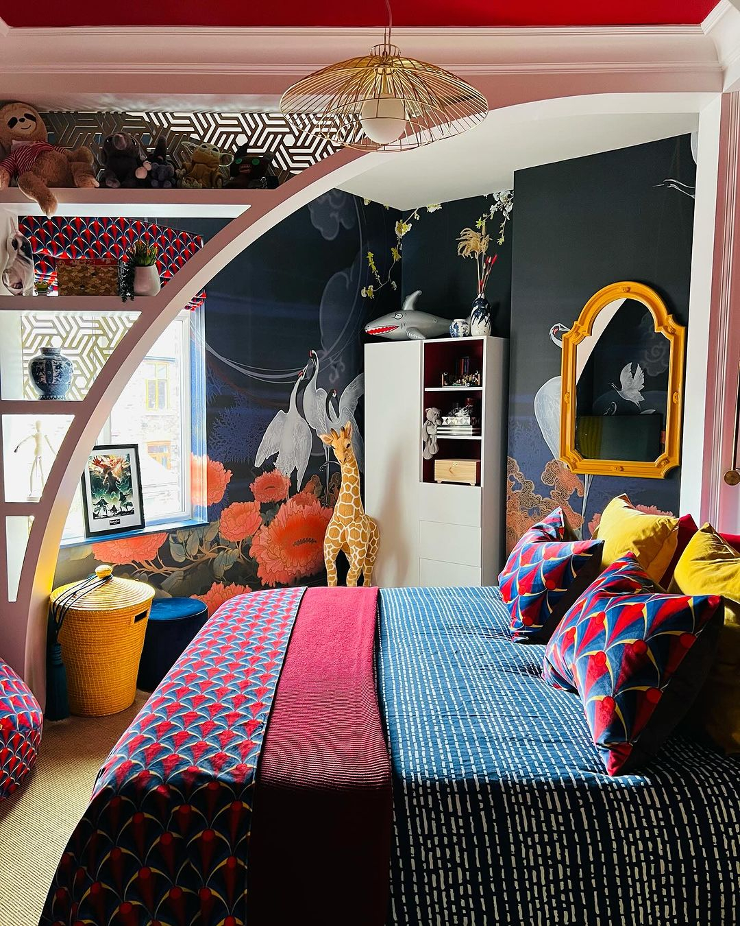
It can be said that this decoration has some modern touches. You can see on the patterns that are applied in the room. For the color combination, it has black, white, red, orange, pink, purple, ad brown. So massive but still proper and not overserving at all. Modern Touches from @letsby.avenue
This room has a strong personality with some bold colors applied. It even uses black color on the wall but then mixes it with the white color as the pattern. There are some geometric patterns in varied colors to add to the personality of the decoration. So interesting for you who want to have a strong brave personality in the room. Bold Colors Application from @colourfulleopard
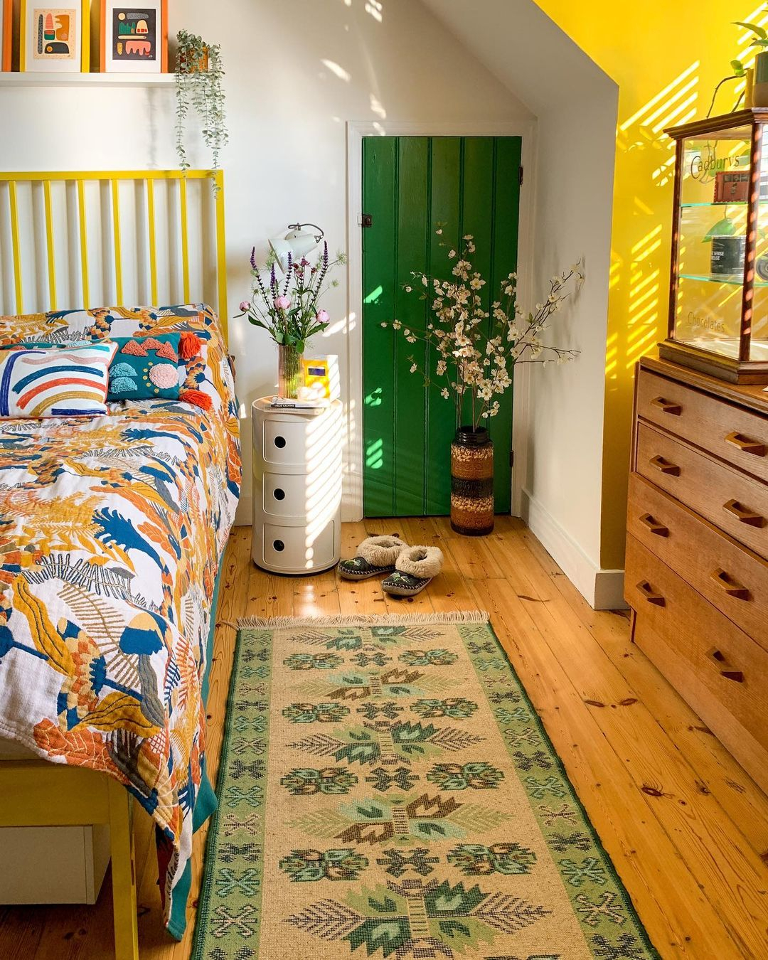
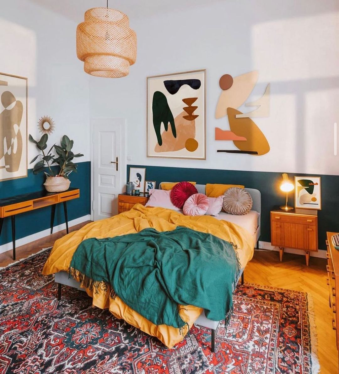
When looking at the colors, this decoration is really simple. It uses green and yellow colors as the color scheme. But, look at how adorable the impression results that this decoration has. It looks fresh in your eyes and feels calming in your mind. If you love something simple, you can do this kind of color combination. Simple yet Fresh from @houseofedencourt
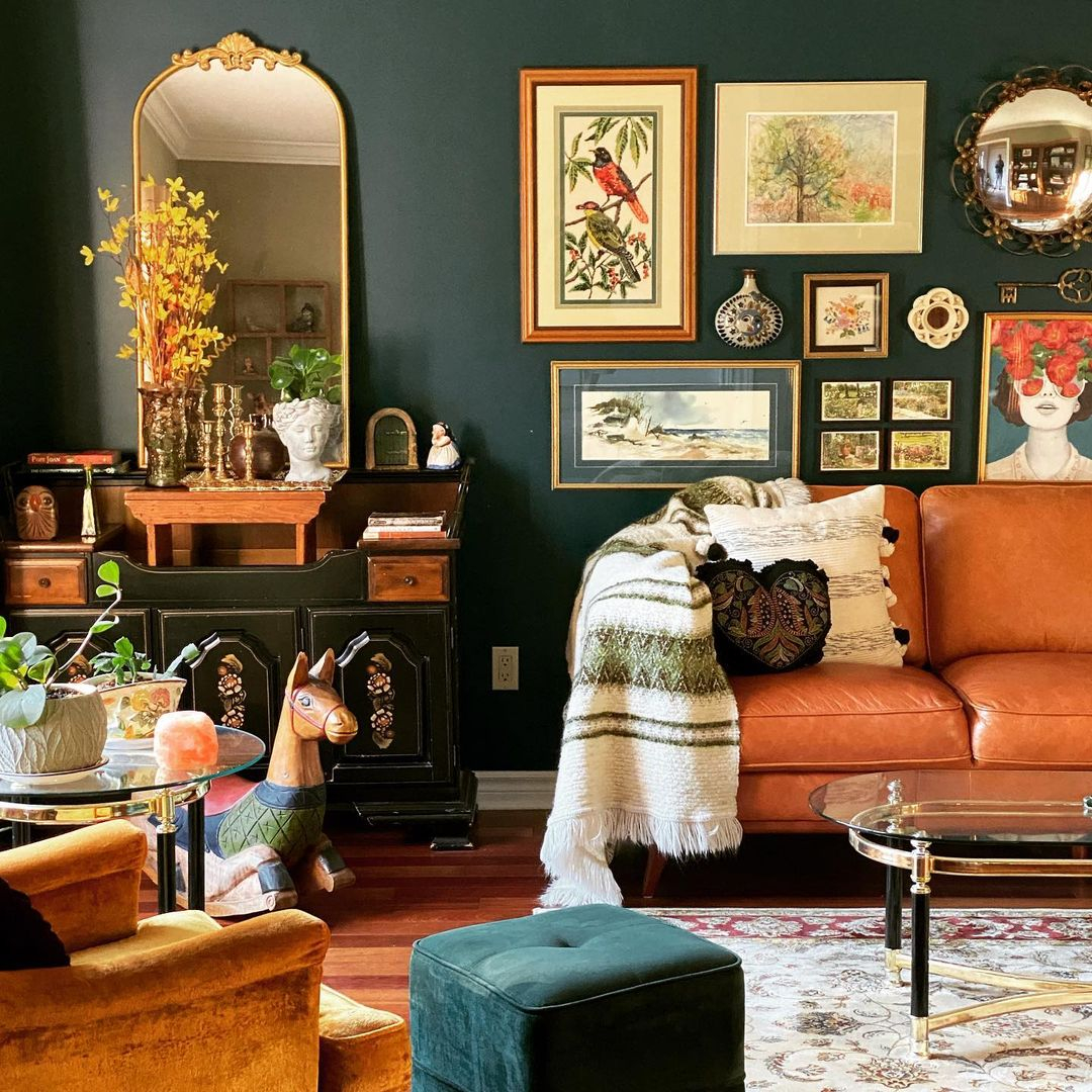
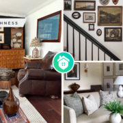
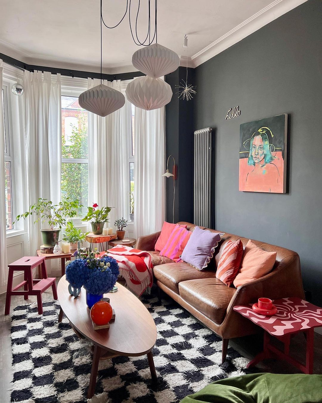
The color of the wall represents the masculine design impression strongly. It is then combined with the brown leather sofa that looks elegant yet masculine. Surprisingly, there is a feminine painting that makes the room decoration feel so unique. The color combination and the design impression are really startling. Masculine Colors Choice from @eclectic.poetic.folk
The color combination of this room is also really interesting. It has a simple soft color combination on the floor area with the sofa, rug, and floor. But then, the decoration starts to stand out from the wall with a gallery of paintings in different colors. Light Grey Scheme from @happyvillageinterior
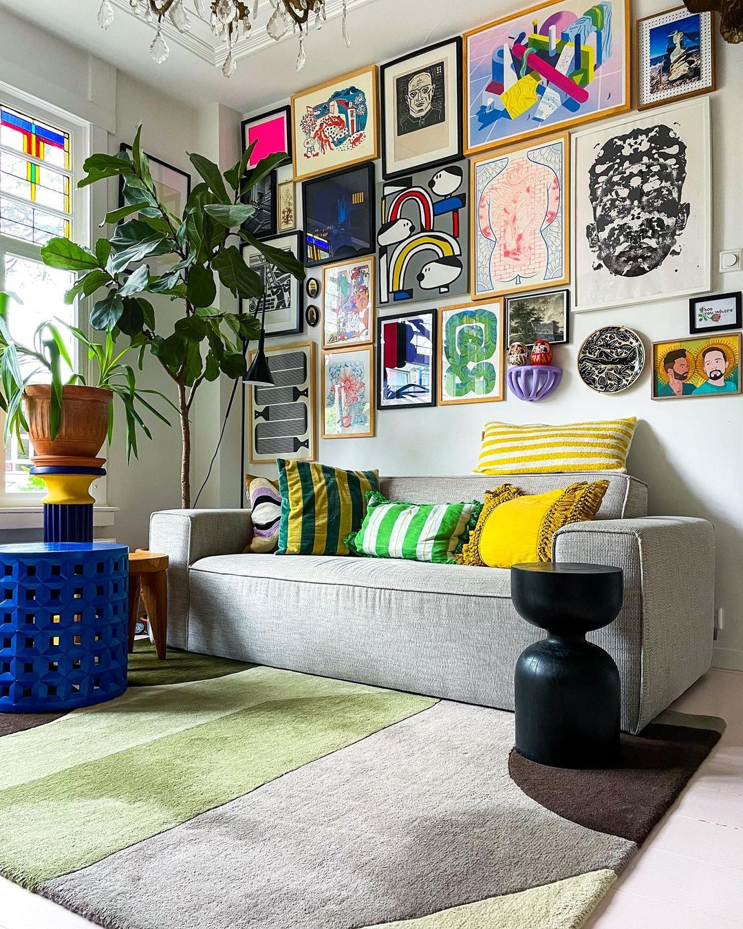
The color combination looks crowded with so many colors being applied. But, surprisingly, it is also calming at the same time. It is because the designer is really good at the color shade choice. You can see how the colors are well chosen. You won’t find too bright colors or the colors that annoy your eyes. Crowded yet Calm from @restyleart
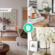
Minimalism is the impression of this decoration when being seen from the color scheme choice. The chosen color is white which is then added to small items in many colors. You can find the color combination on the wall gallery, cushions, and small tables. Minimalist Touch from @peter_kleijnenburg_interior
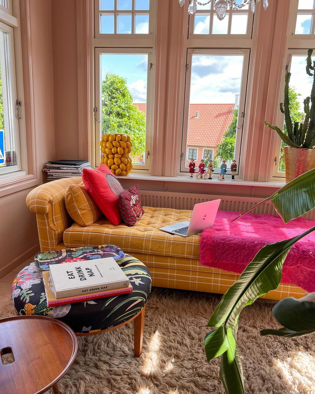
Even when pink is seen as too bright, but not on this decoration. It uses the soft pink color on the wall which is on the largest portion. Then, not to make it look pale, there is a bold pink color being applied on the throw blanket. The pink color is then combined with the yellow color and some different colors here and there on a smaller portion. Sweet Pink Color Scheme from @johnjohnwallmansson
There are so many choices and color combination concepts that you can choose from the references we shared. So, which one is your favorite and want to apply to your eclectic home decor?