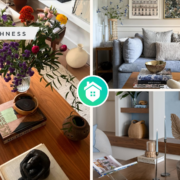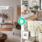
Spring arrives with a promise of rejuvenation, warmth, and vibrancy. Nature begins its colorful bloom, and homeowners often feel the pull to mirror this transformation within their personal spaces. Among the most impactful ways to refresh a home’s aesthetic is through paint—specifically, embracing the latest spring color trends.

In 2025, spring paint color trends are centered around tranquility, optimism, and a return to nature. This year’s palettes highlight a harmonious blend of soft pastels, earthy neutrals, bold botanicals, and serene blues, all designed to bring balance and energy into the modern home. These color choices reflect not just evolving design preferences but also a broader cultural shift toward mindfulness, sustainability, and emotional well-being.
In this article, we explore the trending hues of spring, their psychological influences, and practical ways to incorporate them into various rooms of your home.
1. Soft Pastels: Embracing Subtle Serenity
Soft pastels continue to dominate spring color palettes for their calming and inviting qualities. Colors like powder blue, blush pink, mint green, and lavender offer a gentle infusion of color without overwhelming a space.
Blush pink, in particular, has transitioned from a fleeting trend to a staple in spring interiors. Its warm undertone brings softness to walls and pairs beautifully with neutral or metallic accents. Similarly, powder blue evokes clarity and peace—an ideal choice for both modern and traditional spaces.
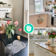
Designers are increasingly using these pastels in unexpected ways, such as painting ceilings, trim, or cabinetry, creating depth and visual interest without straying too far from minimalistic themes. Here are some examples of pastel paint colors to inspire you.
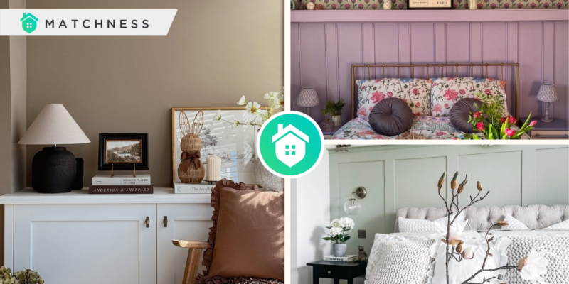
- Lavender
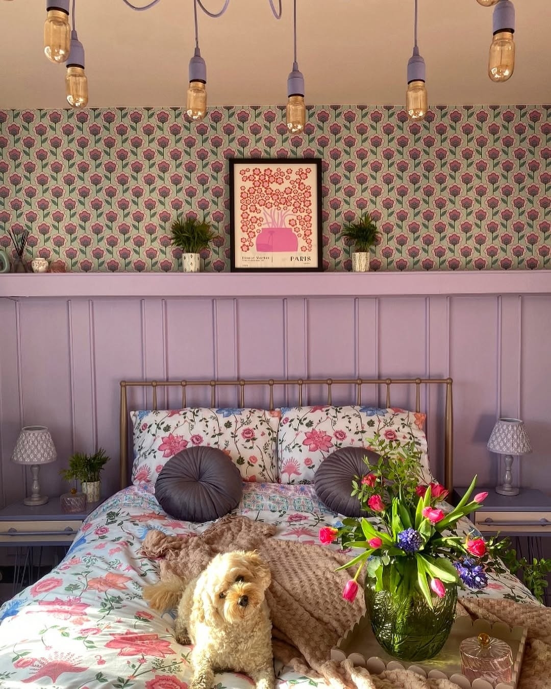
Lavender and floral patterns in a bedroom create a spring-inspired atmosphere, while soft purple and delicate flowers add elegance and tranquility. Lavender color from @our_casa_flamingo
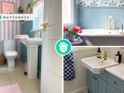
- Powder Blue
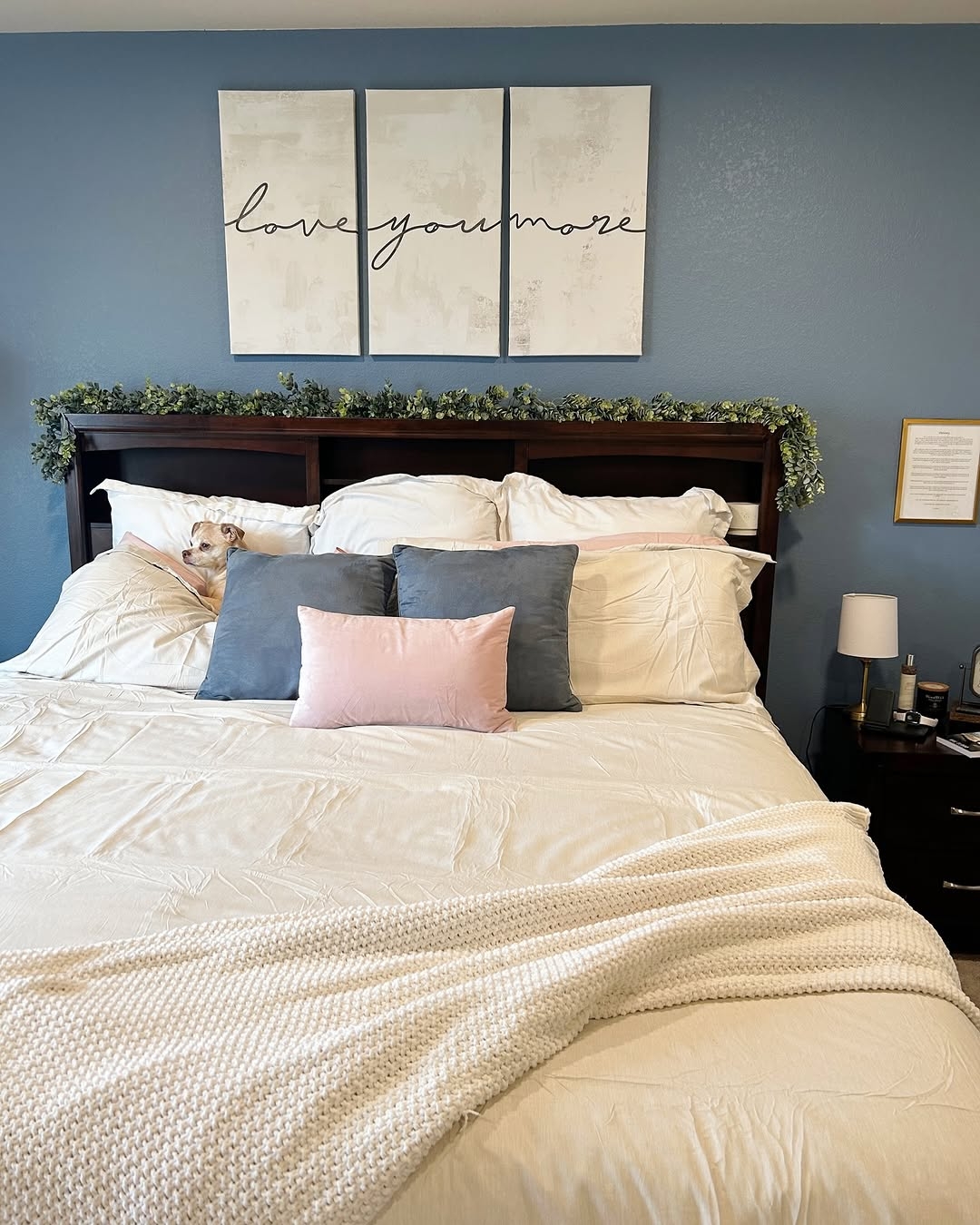
The powder blue wall in the spring bedroom creates a serene, inviting atmosphere perfect for relaxation, while the subtle hint of color adds freshness. Powder blue wall from @homebydelaney
- Mint Green

The mint green and white walls create a serene spring bedroom with soft pastel colors. It promotes calmness and freshness, ideal for unwinding after a long day. Mint green from @countryhomeni
Tips: Apply these hues in the bedrooms, spa-inspired bathrooms, or peaceful reading nooks. They are especially effective in creating a serene and cozy atmosphere.
2. Earthy Neutrals: Connecting With Nature
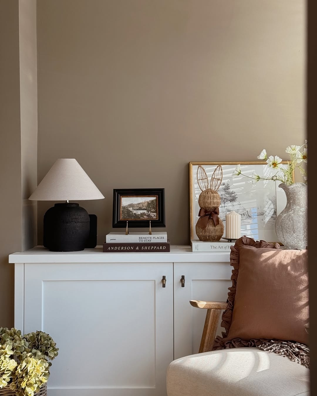
In line with the growing desire for grounding environments, earthy neutrals are experiencing a resurgence this spring. Tones such as white, clay, taupe, sandstone, and warm beige reflect nature’s raw beauty and contribute to a comforting and organic atmosphere. These shades are incredibly versatile and timeless. When paired with natural materials like wood, stone, or linen, they create an understated elegance that feels both contemporary and enduring.
The rise of “greige”—a blend of gray and beige—also continues, offering a sophisticated neutral base that can adapt to various lighting conditions and decor styles. This flexibility makes it a go-to option for designers working across a range of interior aesthetics.
- Warm Beige
Create a fresh living room atmosphere by pairing warm beige walls with spring decor and floral accents. It enhances the space’s brightness and renewal. Warm beige from @athomewithfran
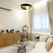
- Gray and Beige
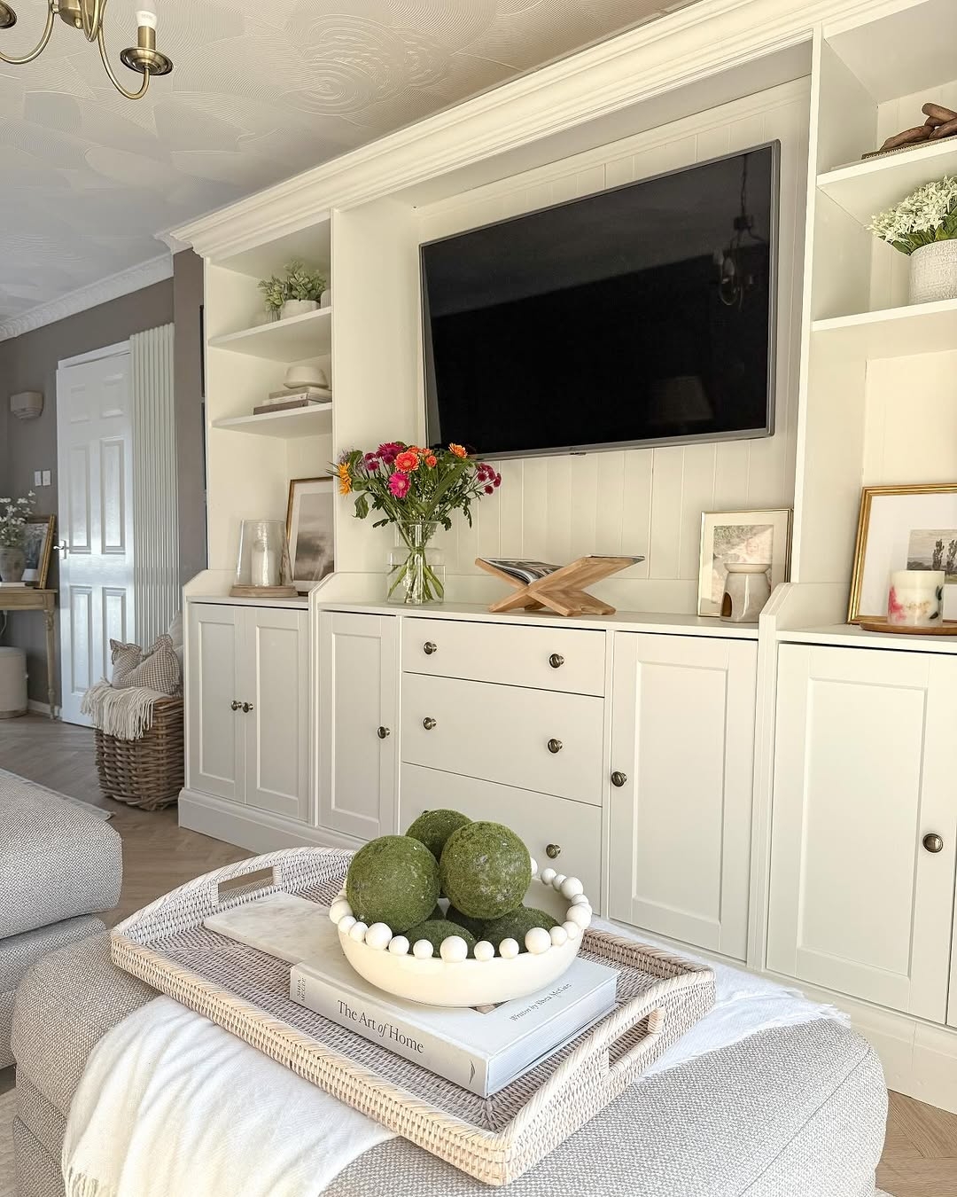
Combining gray and beige for spring living room decor can create a calming and sophisticated atmosphere. Incorporating natural textures like a rattan tray and linen adds warmth and depth to the space. Grey and beige from @simplycornishcosy
- White
Applying white paint to the whole room will create a bright and airy atmosphere. It makes the spring living room feel fresh and inviting. This simple update can also make the space appear larger and more spacious. White paint from @thecoastaloak
Tips: Earthy neutrals are particularly popular in living rooms, kitchens, and open-plan areas where homeowners seek a cohesive and calming environment.
3. Bold Botanicals: Bringing the Outside In
Spring 2025 has also ushered in a bolder embrace of botanical-inspired hues. Vibrant greens, rich terracottas, yellow, and deep ochres are making their way into homes, inspired by gardens, forests, and sun-drenched landscapes.
Emerald green and olive tones are particularly notable for their ability to breathe life into a room. Whether used as an accent wall or an all-over statement, green symbolizes growth, harmony, and energy.
Terracotta and ochre, on the other hand, offer a sun-warmed richness that works well in Mediterranean-inspired interiors or eclectic spaces filled with layered textures and patterns. These shades not only energize a room but also complement vintage and handcrafted furnishings, making them a favorite among those drawn to artisanal aesthetics.
- Vibrant Green
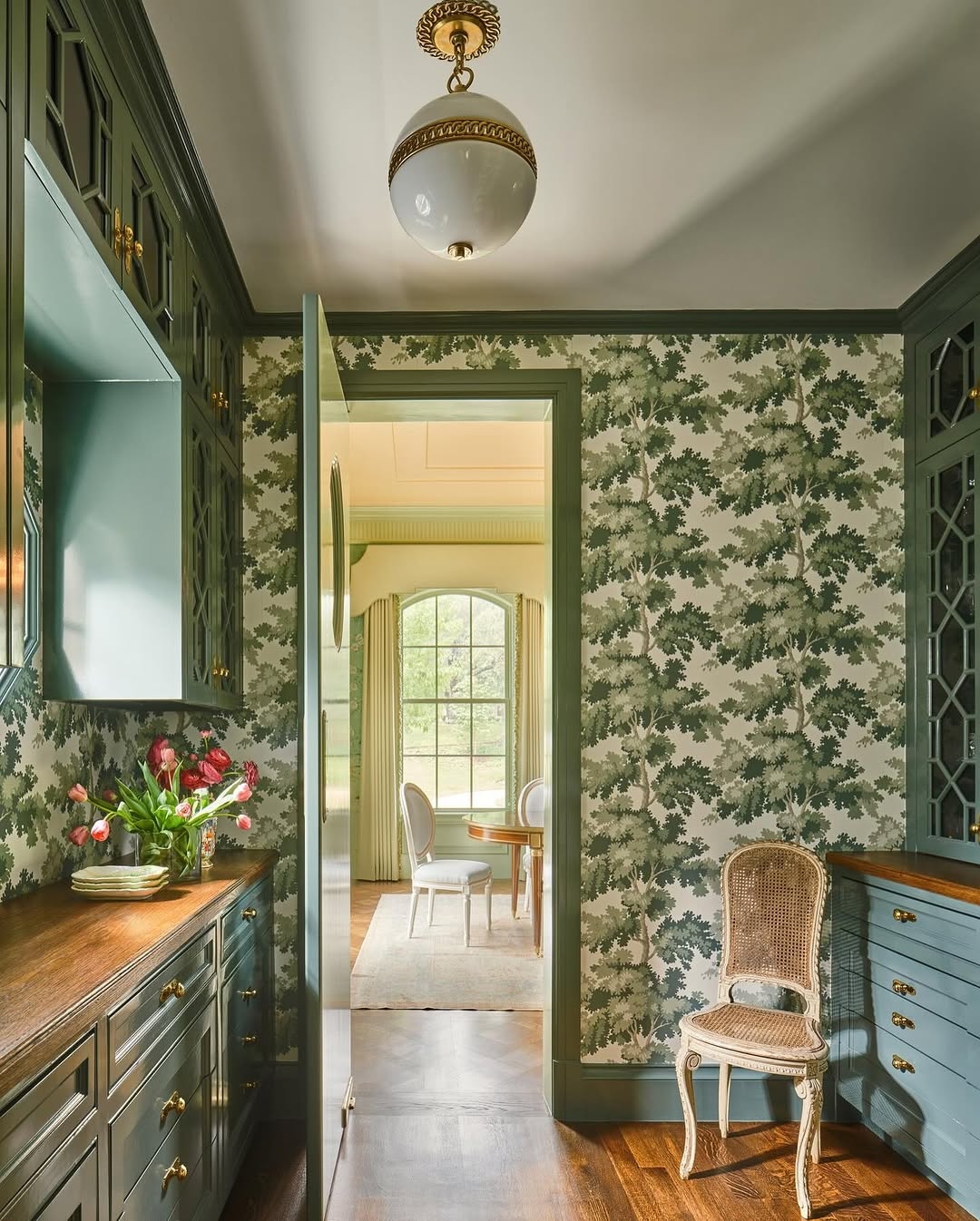
Emerald green kitchen cabinets and wallpaper enhance the space with a bold, botanical spring vibe, adding luxury and sophistication. Vibrant green from @kmg_designstudio
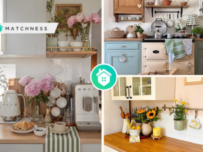
- Yellow and Terracotta
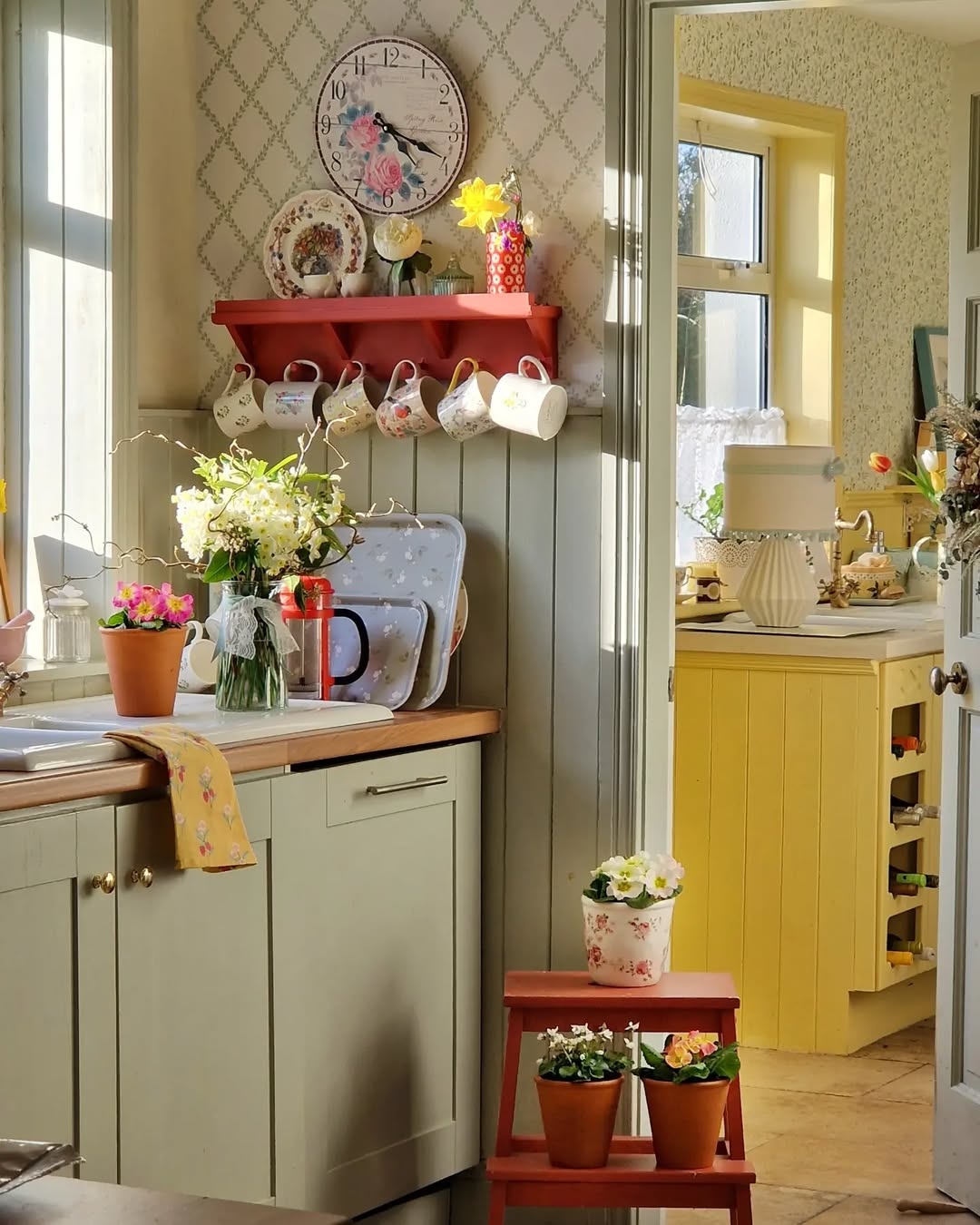
The yellow kitchen with terracotta accents provides a warm, natural feel, flooded by natural light and large windows. This is ideal for fresh meal preparation during spring. Yellow and terracotta accents from @cooneynest
Tips: Botanical-inspired shades are ideal for spaces like kitchens, dining rooms, or home offices, where a touch of natural inspiration can enhance creativity and focus.
4. Serene Blues: Coastal Calm at Home
Blue has always been a popular interior color, but this spring sees a particular emphasis on soft, watery tones that evoke a coastal calm. Sky blue, seafoam, and dusty denim are among the leading contenders in this category, promoting a sense of openness and tranquility. When paired with white, sandy beige, or natural fiber textures, they help create a breezy, beach-inspired aesthetic perfect for spring and summer living.
Additionally, using blue in interior design has been shown to lower blood pressure and heart rate, reinforcing the idea that color can have a significant effect on mental health and well-being.
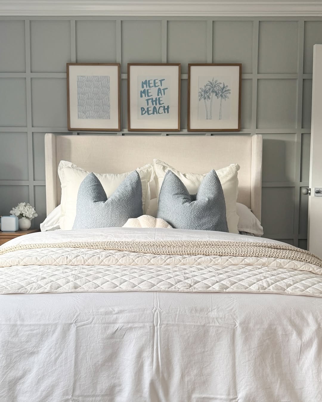
The bedroom is adorned with a chic coastal spring vibe, featuring a dusty denim paint accent wall, crisp white linens, and natural wood furniture for a relaxing atmosphere. Dusty denim paint from @meggieferrerhome
Tips: Serene blues are especially suited for bathrooms, bedrooms, and transitional spaces where relaxation is key.
How to Choose the Right Spring Color for Your Home
Selecting the right paint color involves more than just following trends—it’s about identifying what resonates with your personality, lifestyle, and the unique qualities of your home. Here are a few tips to guide your choice:
Consider natural light: Rooms with ample sunlight can handle cooler tones like mint or powder blue, while darker rooms benefit from warm neutrals and pastels.
Start with a feature wall: If you’re hesitant about a bold color, try painting a single wall or smaller area to test its impact.
Use color psychology: Think about how you want each room to feel. Calm and soothing? Go with pastels or blues. Energetic and creative? Opt for greens or warm botanicals.
Coordinate with existing décor: Ensure the paint complements your furniture, artwork, and textiles to create a cohesive space.
Conclusion: Painting a Fresh Perspective
Beyond aesthetic appeal, these trends reflect deeper values—connection to nature, emotional balance, and a renewed sense of hope and possibility. By embracing the season’s most inspiring hues, you can create a sanctuary that not only looks beautiful but also nurtures your spirit.
As you consider your next interior update, let spring’s palette guide you toward a space that feels as fresh and revitalized as the season itself.