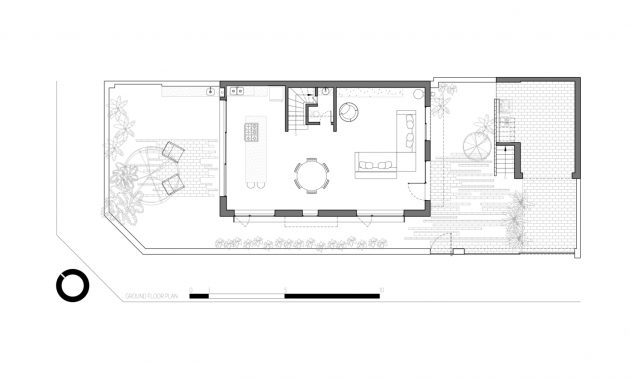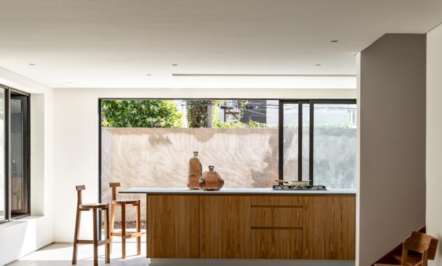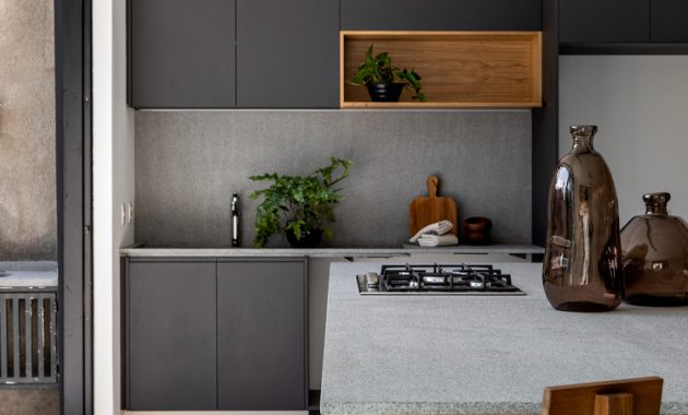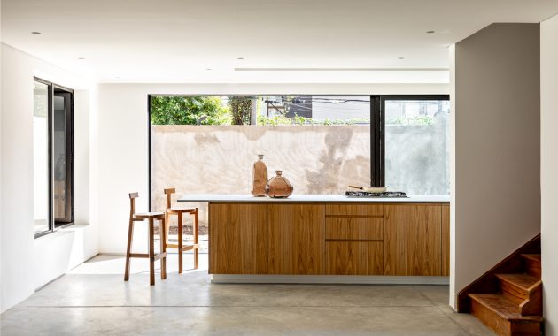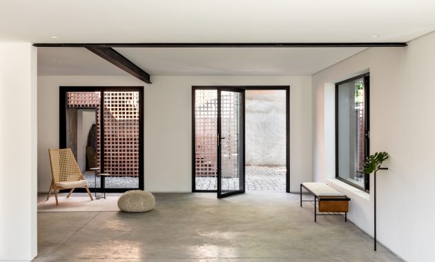
Since the first time Guelo Nunes Arquitetura came to this house, they knew that it need a major intervention. “The walls on the ground floor interrupted the communication between the internal spaces and also their connection with the exterior of the house. On the first floor, the distribution was disconnected and fragmented with small and low quality spaces. When studying the original division of the house, I realized that the original living room area was too narrow, the entry hall too generous and the kitchen and dining area too big.”
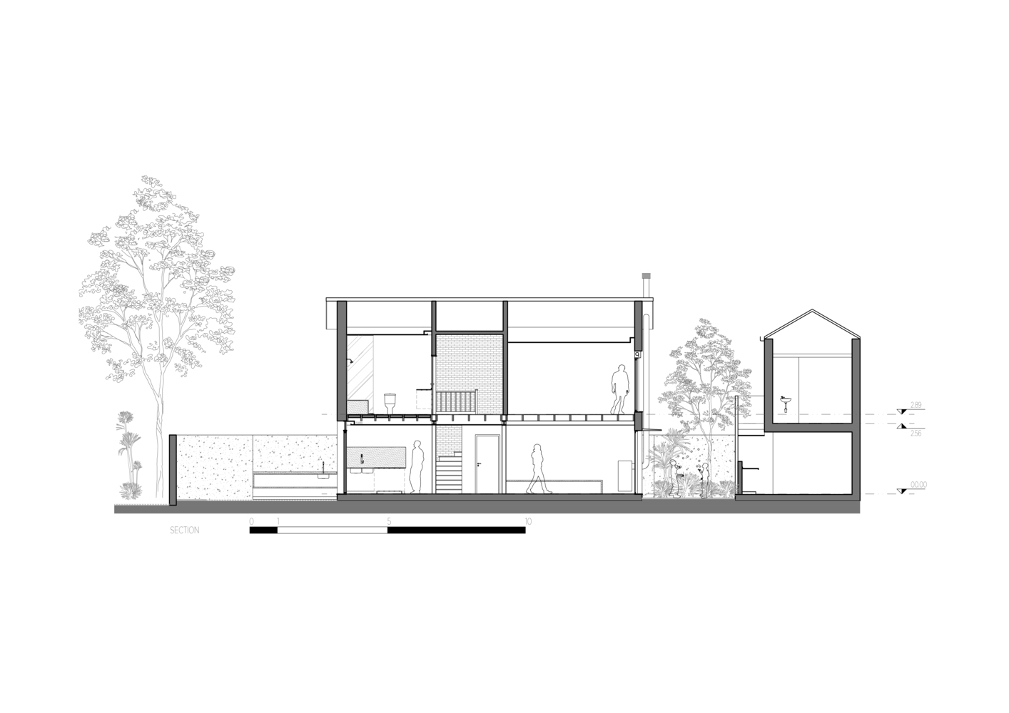
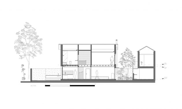
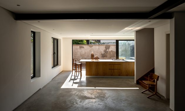
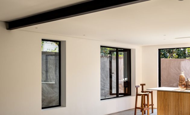
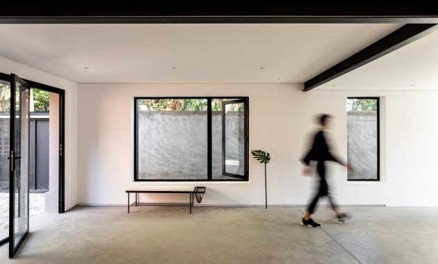
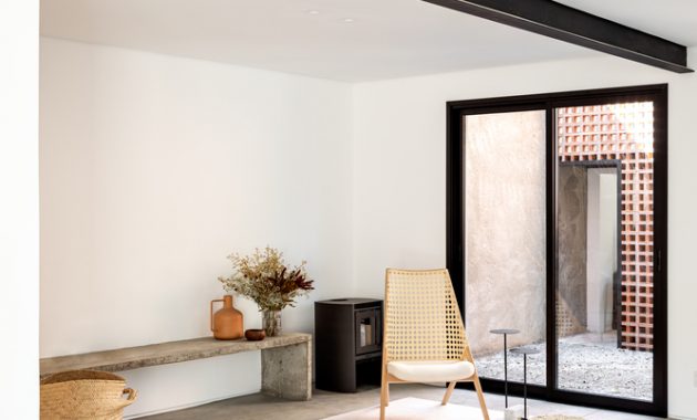
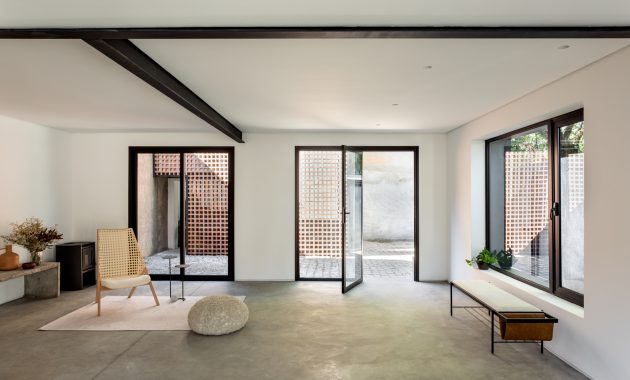
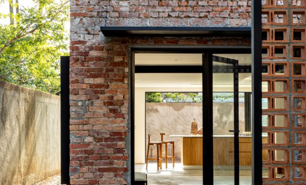
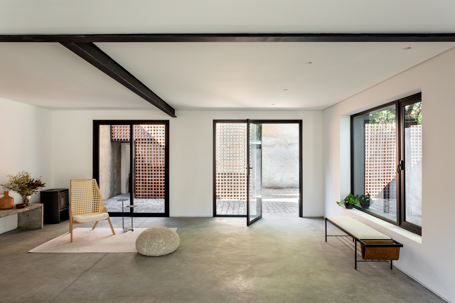
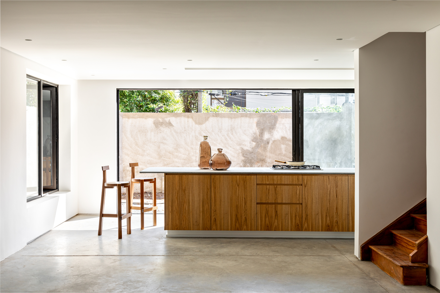
From this point of view, the architect decided to reverse the space. The old living room become the kitchen. And the dining room is where the entry hall was and the living room is where the kitchen and dining use to be. And to make those transformation’s happen, they set a metallic beans to support the walls on the first floor, align with the ones on the ground floor. The make the beans visible to remind the owner of the history of the old house.
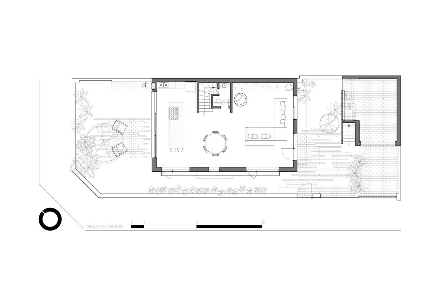
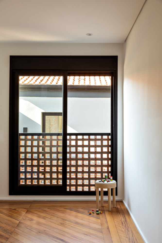
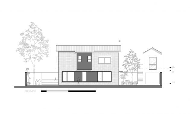
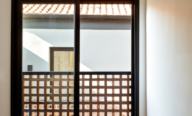
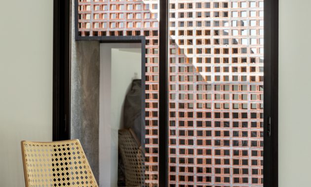
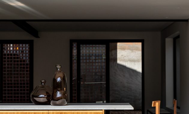
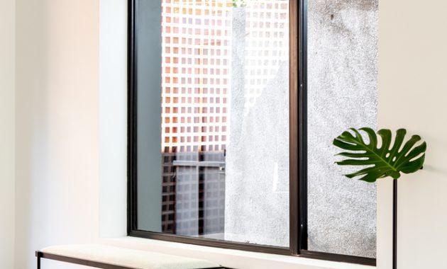
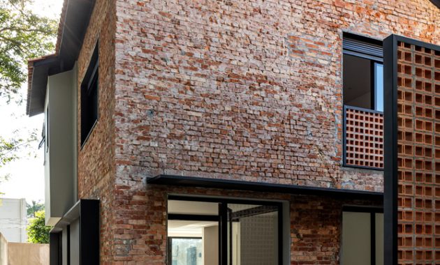
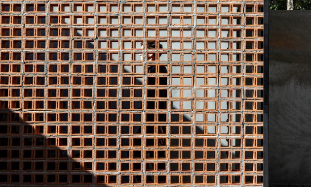
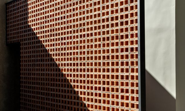
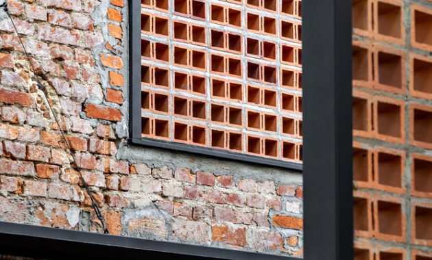
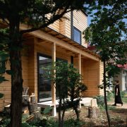
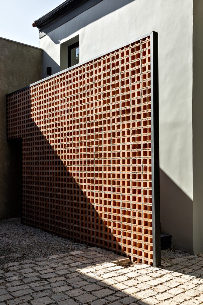
Another reason for the layout inversion was simply because they want to create a beautiful entry garden. The architect make an entry by a patio between the main block and the outbuilding. They set a hollow brick beside the outbuilding’s access stairs. It display the passage of time through the change of light and shadows. This action creates a dynamic and elegant background to the living area. It will look better in the night.
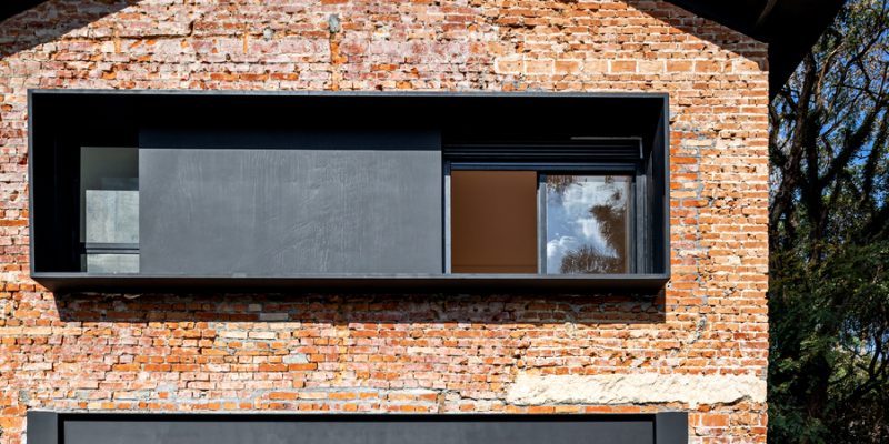
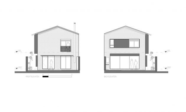
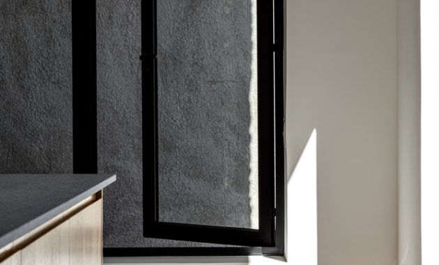
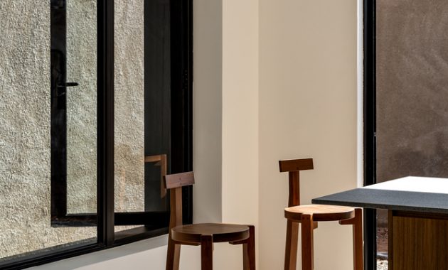
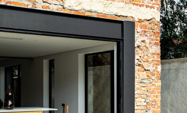
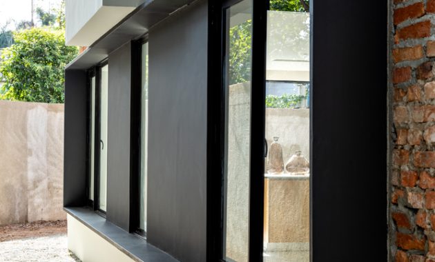
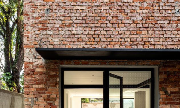
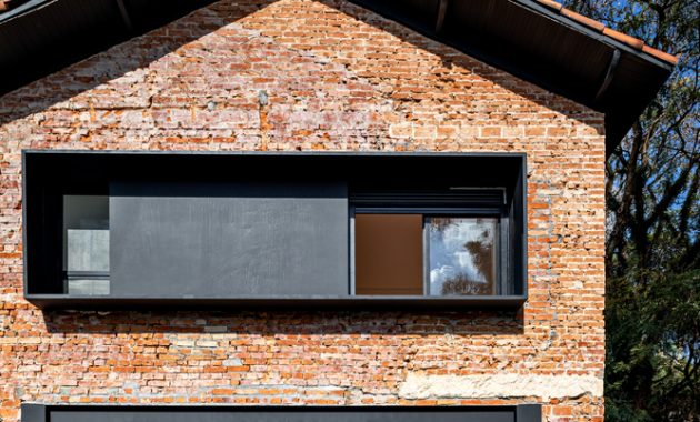
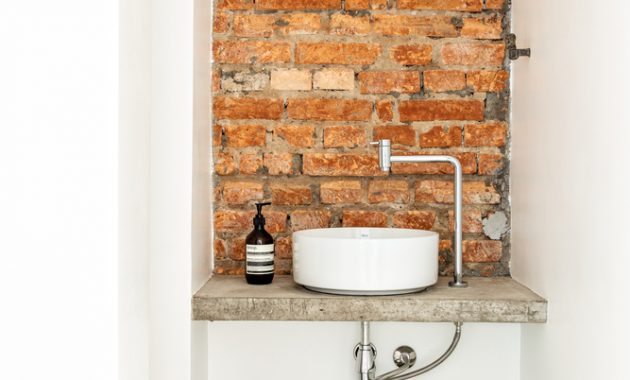
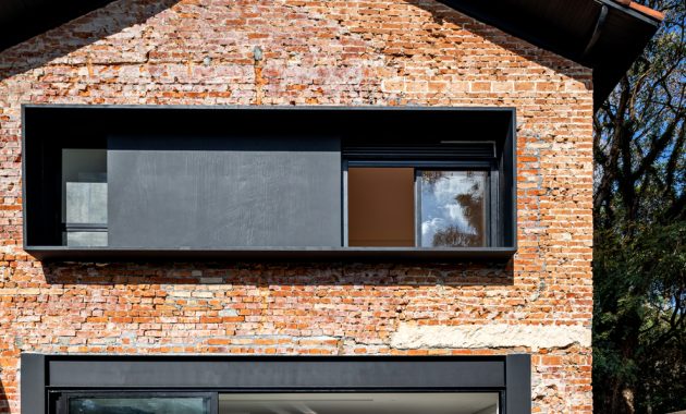
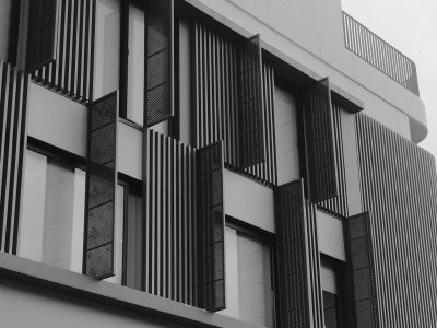
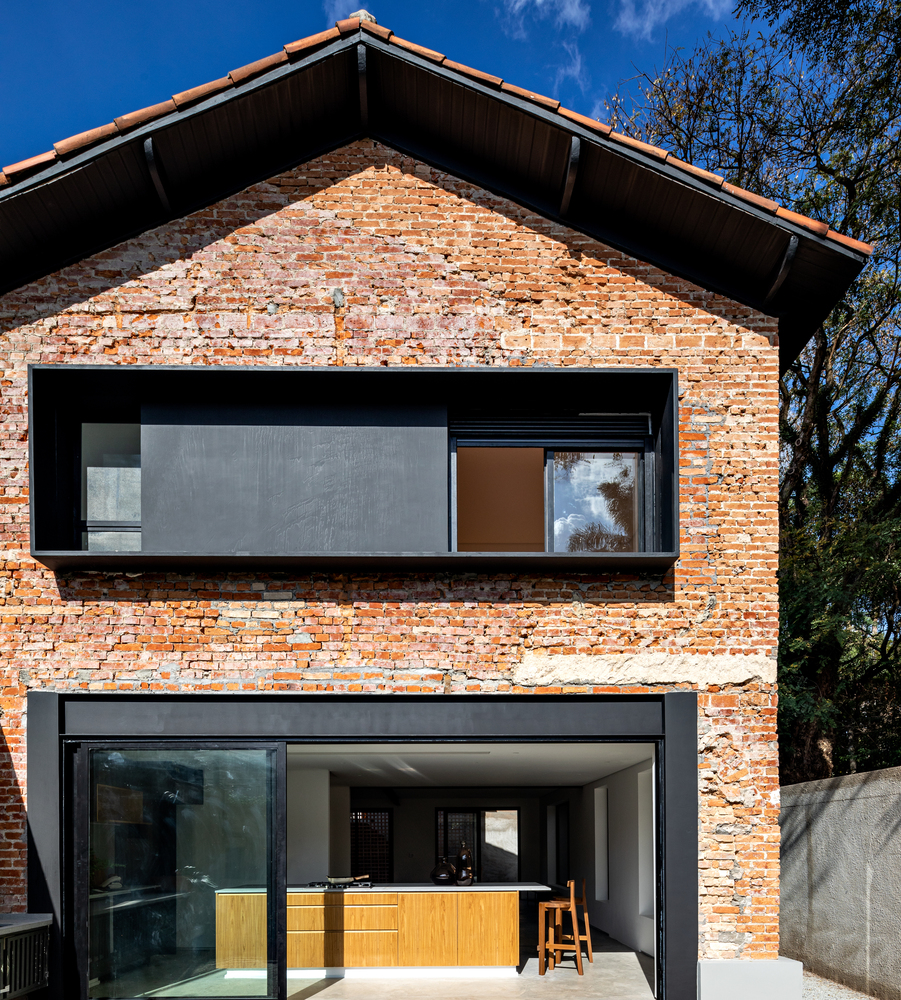
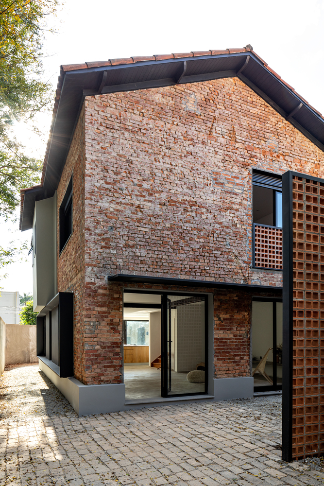
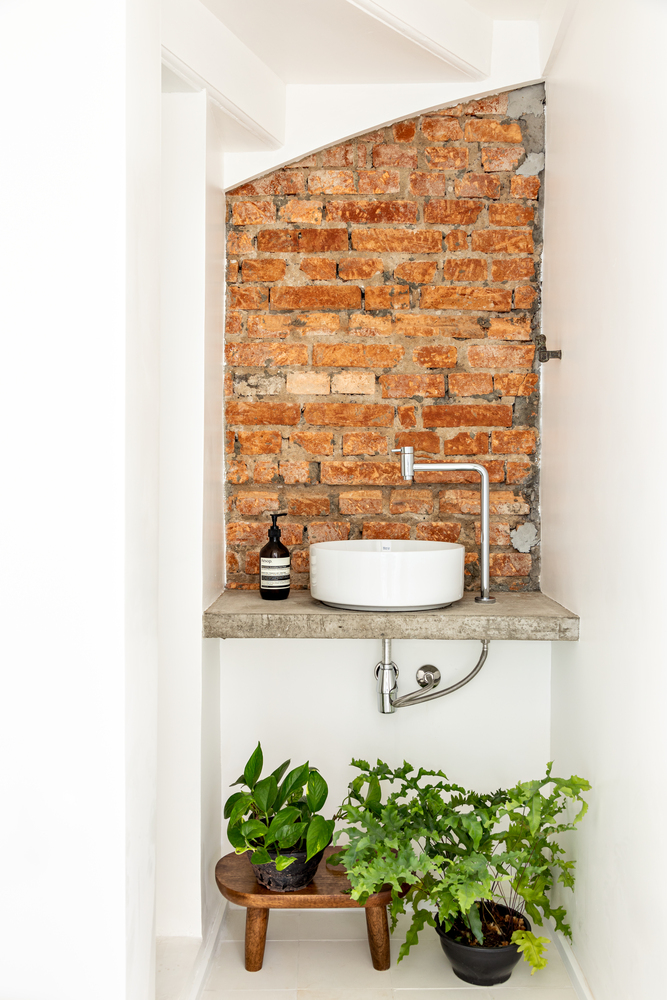
Guelo Nunes Arquitetura also peeling the external facades. And we can see an original expose brick walls which left unrepaired. To organize the new opening, they create a 11in deep metallic black boxes around the window. The purpose is to hide the old ones and protecting the window from the rain. And they paint the wall between them in black to create a horizontal elements on the facade.
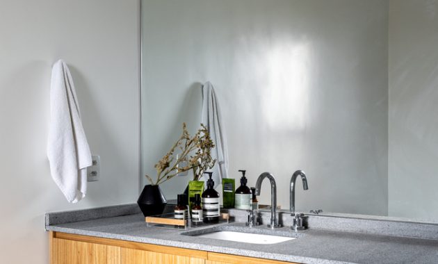
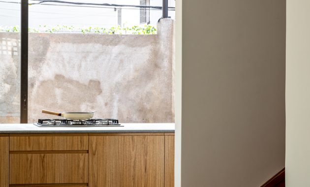
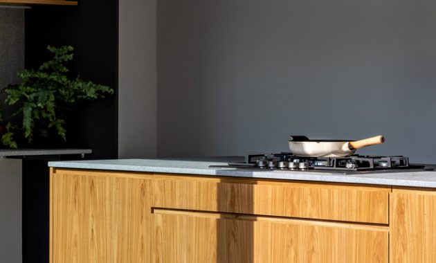
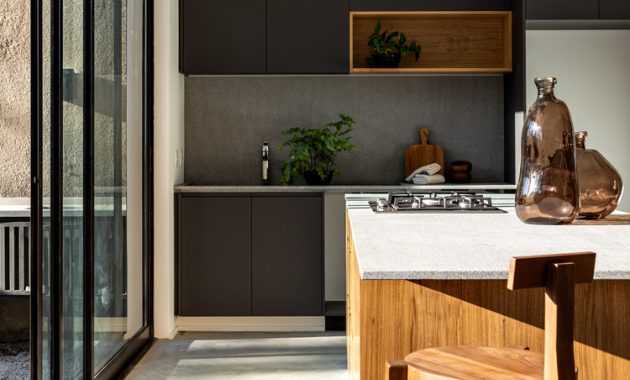
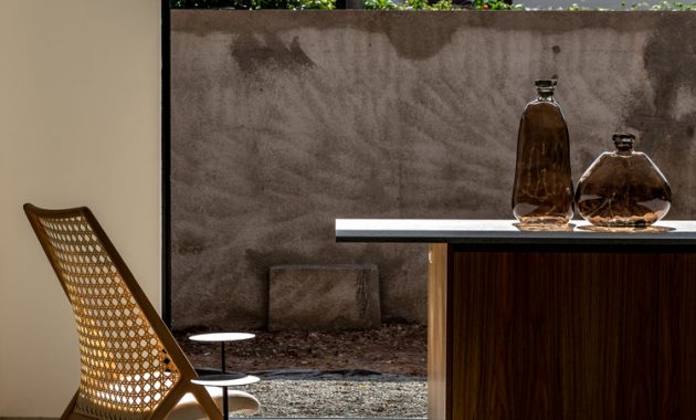
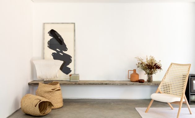
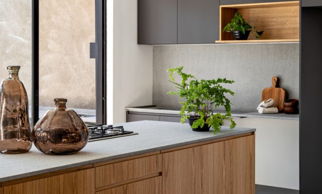
The balancing the rustic facade, they choose a simple and pure materials for the interior. The floor is its own slab polished and varnished. The white walls and ceiling removing an exaggerated impression that will guaranteeing a fluid feel of the space. It also enhancing the connection with the exterior, framed by the new opening. And the raw granite on the kitchen top strengthen the concept.
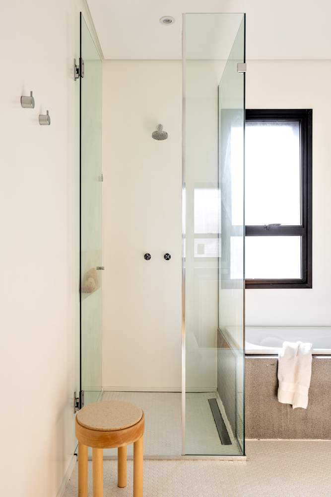
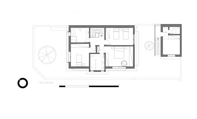
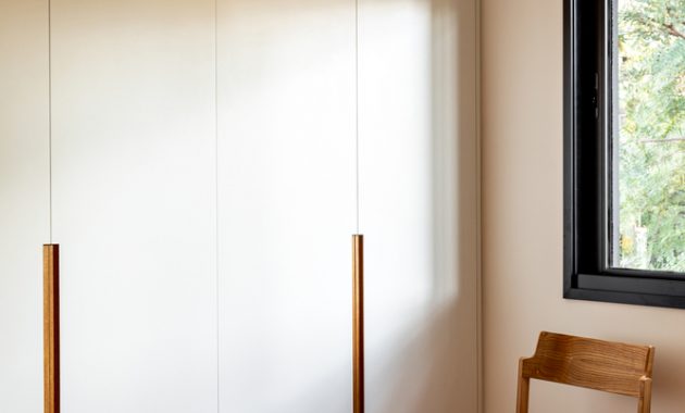
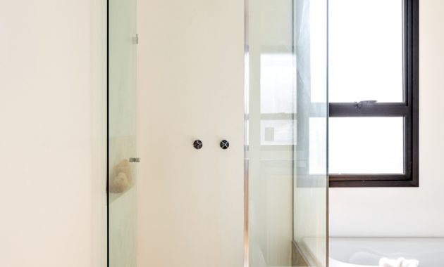
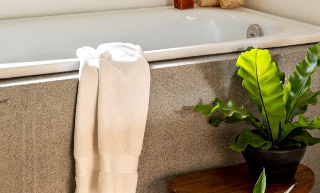
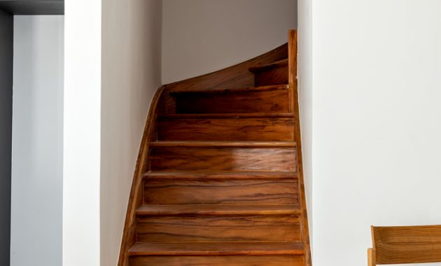
On the first floor the layout was all reviewed. They create a new bathroom to the hall and make the master bathroom bigger than before. All windows are bigger and larger now. They also restore the original wooden floor.
This Project reflects, from the beginning, trust and synergy between clients and architect and the final result shows exactly that.
https://www.archdaily.com/946189/maestro-residence-guelo-nunes-arquitetura?ad_source=search&ad_medium=search_result_projects
