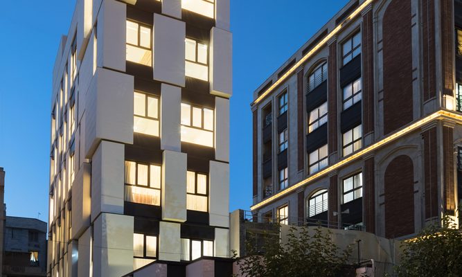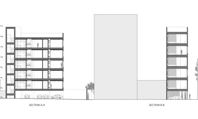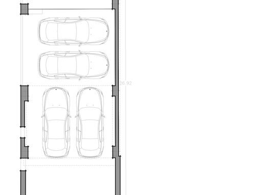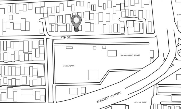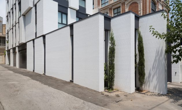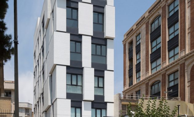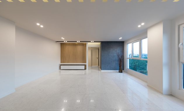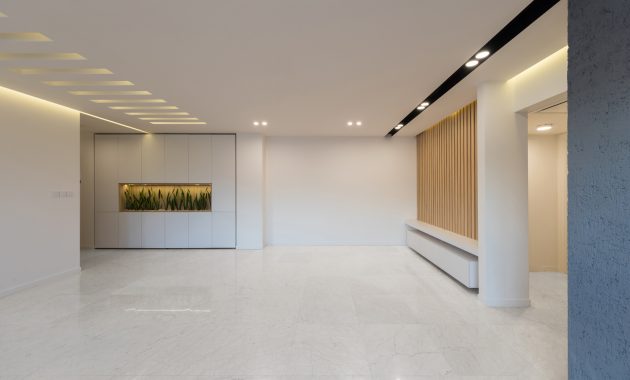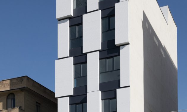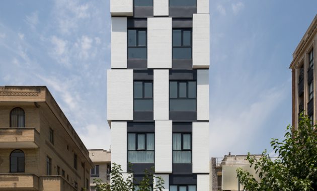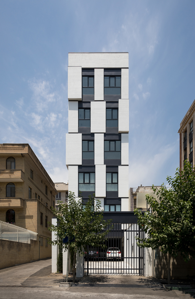
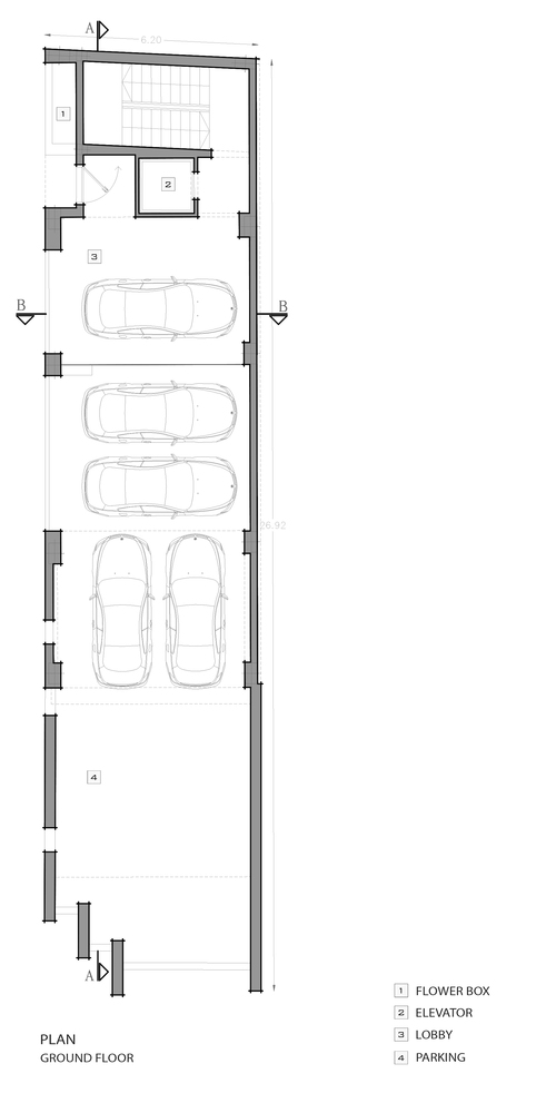
This building is located in Amirabad neighborhood of Tehran. The challenge for Hamedart’s team in this project project is making a building in small width. The entrance of the building is from the southern and western sides. So, what’s their solution to make this 5 floors building with limitations in interior design and exterior?
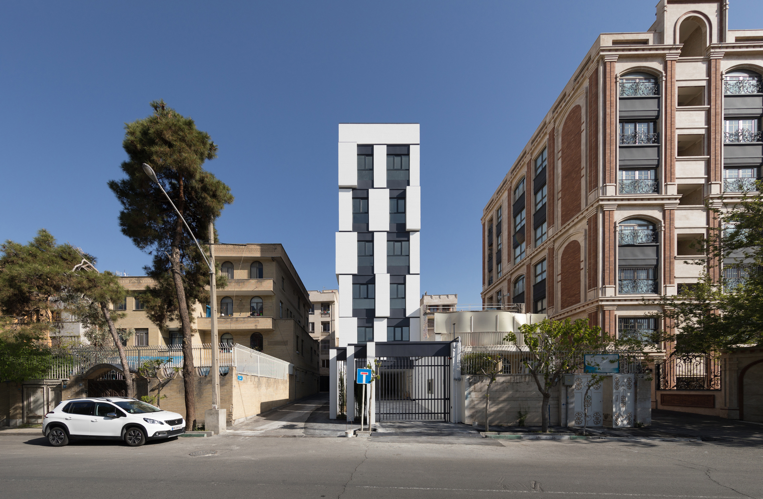
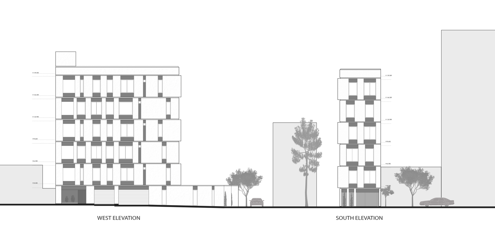
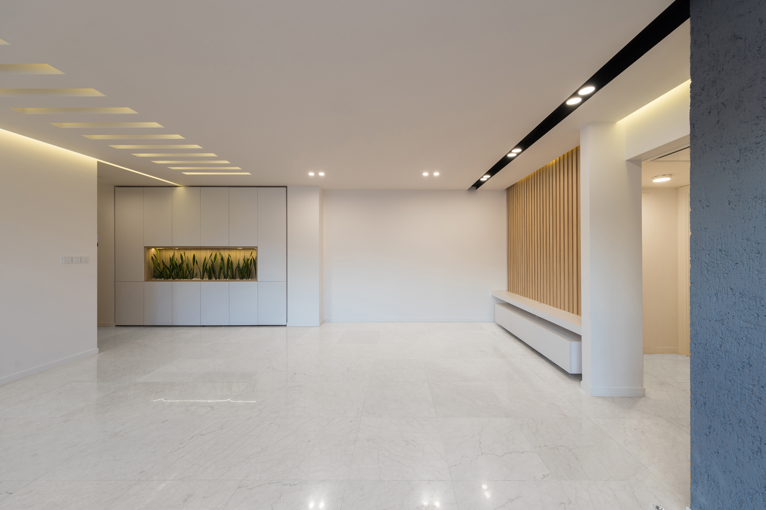
Due to a poor and lack of attention designs, this building become an undesirable place to living in it. The view of this building play the main role to attract passers-by. But it has a smaller width. That is why it prevent people to choose this place to live in.
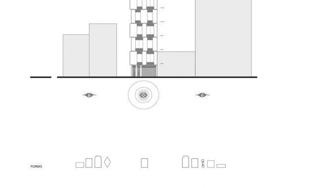
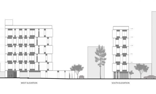
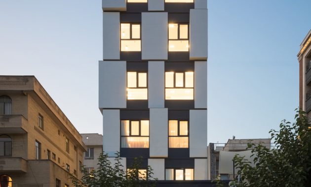
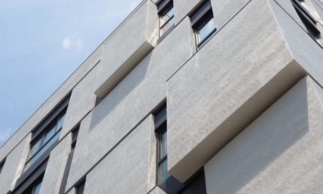
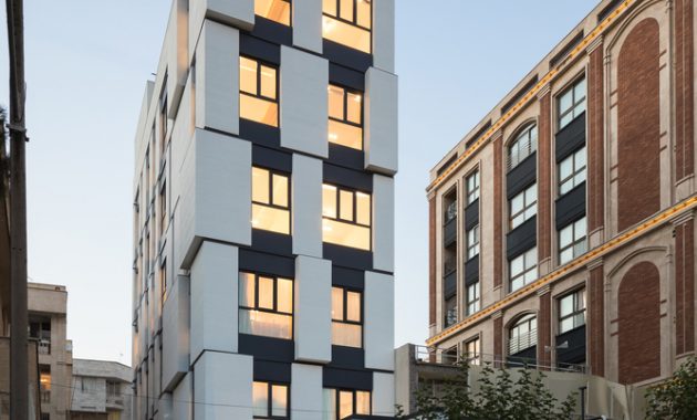
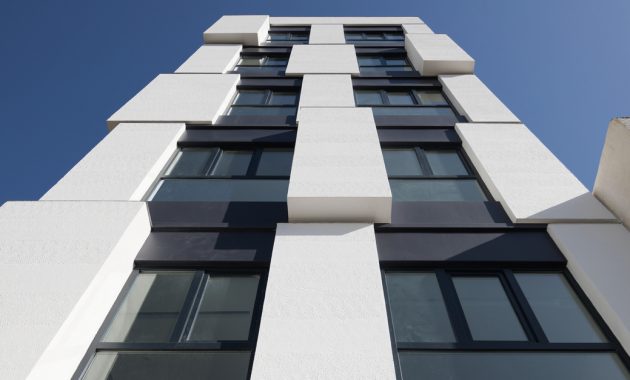
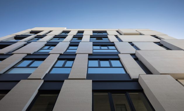
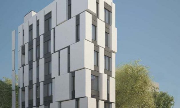
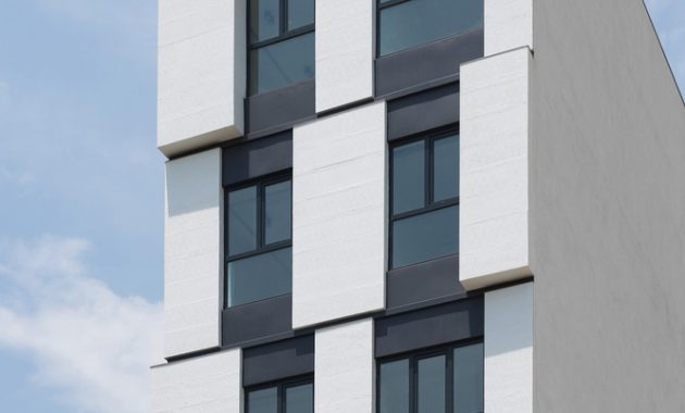
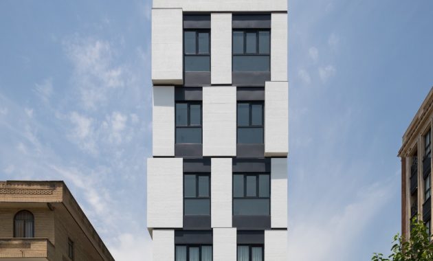
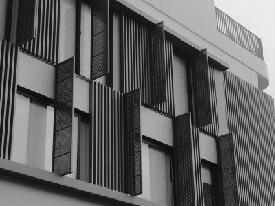
‘Therefore, we designed the facade by breaking its main elements into smaller separated parts with different dimensions, which reduces the visual impact of the main façade ‘s narrow width. The facade became a clear representation of the strong geometry of the cubes that were used as the basic design elements,’ said the architect.
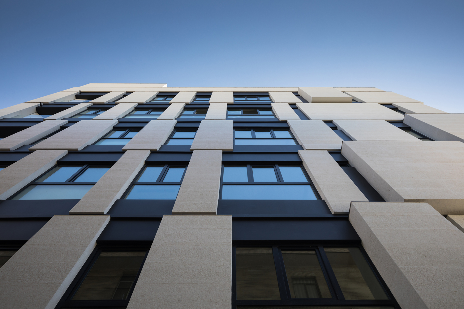
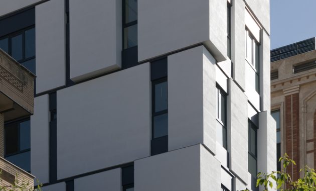
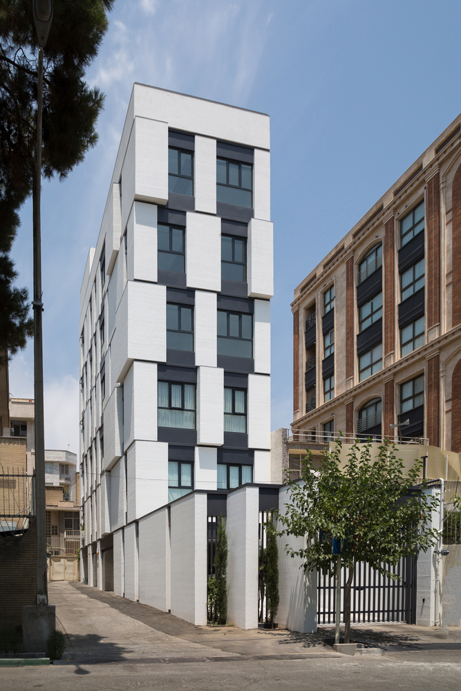
Team also expanding and enlarging the facade by choosing white and light color of the facade cubes in the dark background. Also, the different thickness of these cubes intensifies difference. This gives a better vision to the flat surface. Form an extension form of the smaller side to the larger on is also another design solution for this building. This actin resulting a confusion about the main facade’s borders while made it seems larger and more prominent.
Since this building have two side, Hamedart create a chamfer in the corner of the building. In order to fit the other forms, they follow the regulation by solving the wall chamfer with fractures that distinguish it from its common counterparts.
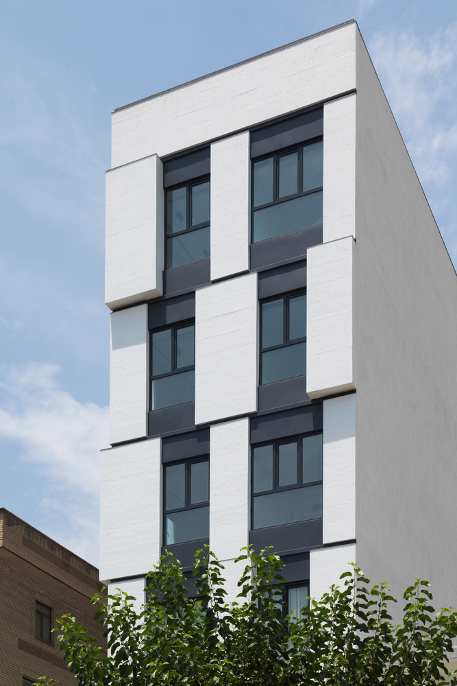
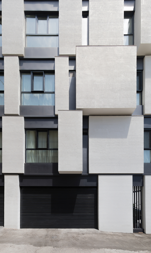
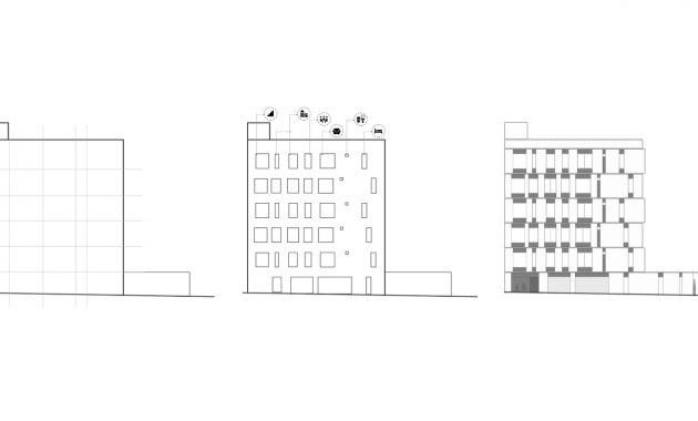
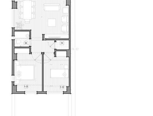
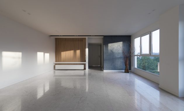
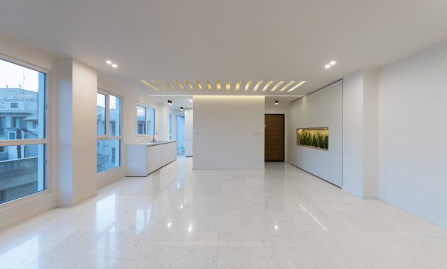
Divisions will help the observer to understand the interior spaces in this view. The plan is designing a building so each space have natural light. And the variety of dimensions of the windows in the facade shows the function of each space and the amount of natural light entering the space.
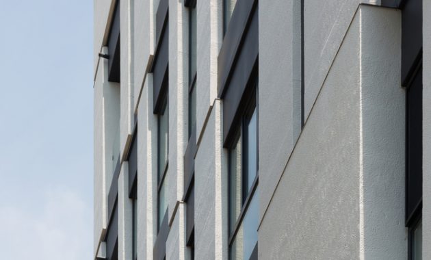
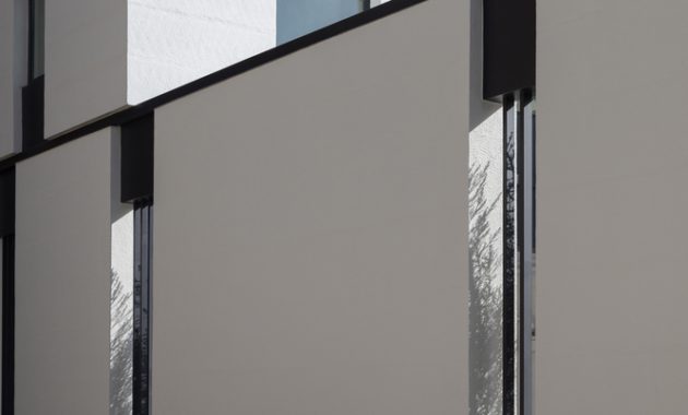
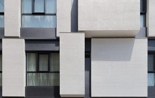
‘The different thickness and retractions of boxes will cause light refraction and shadow, and the bedroom wall facing the west side with minimal opening protects against western light in addition to being private and cozy.’
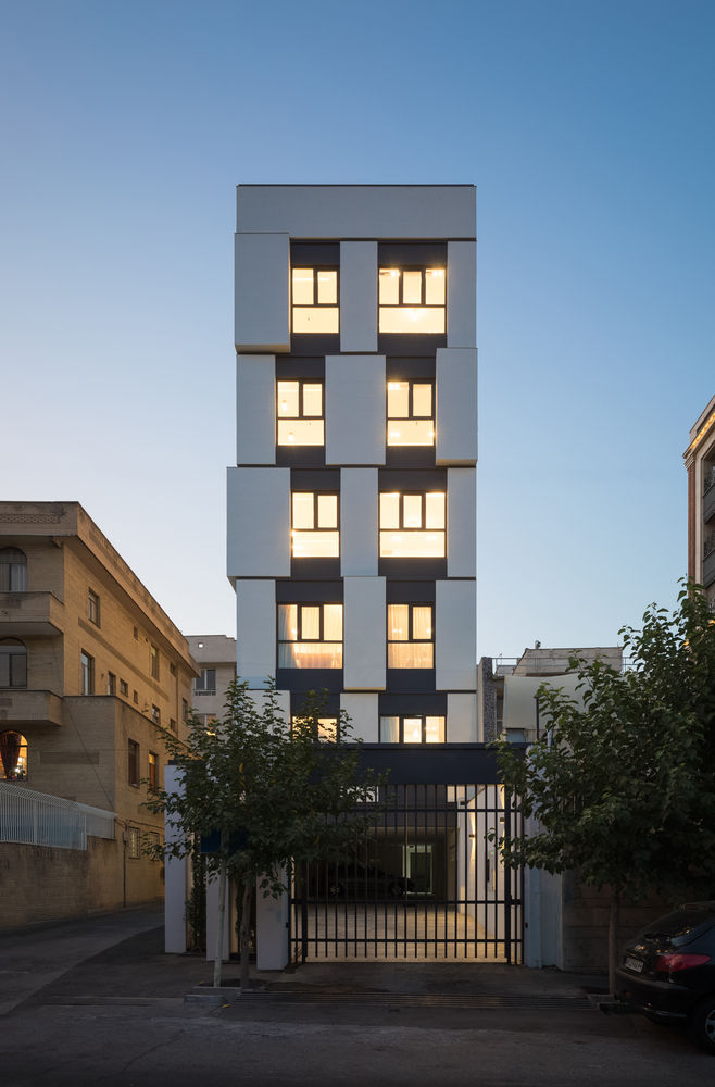
The rigid forms with minimal openings will start from the private space, bedroom. And as it moves towards the living room and kitchen, the rigid space will decrease. And finally, there is an open space there, the balcony. White stone is the cube’s material in this building. And the dark surfaces between cubes are profiles. For these profiles, it use the car color due to its resistance to weather conditions. This is such a simple and unambiguous characteristics but it give great perception to the mind and will make this space readable.


