Have you ever been really excited about a piece of artwork that you purchased, but then once you hung it on your wall, the look wasn’t quite what you envisioned? You’re not alone! Interior design and home decorating can be really intimidating.
The good news is, if you already have a poster that you love – something that speaks to you or simply brings a smile to your face – the hard part of the design process is already over! Now, you can use it as your anchor point and coordinate any new art and decorations around that piece. Check out the 3 easy styling tips below for some home inspiration and room decorating ideas.
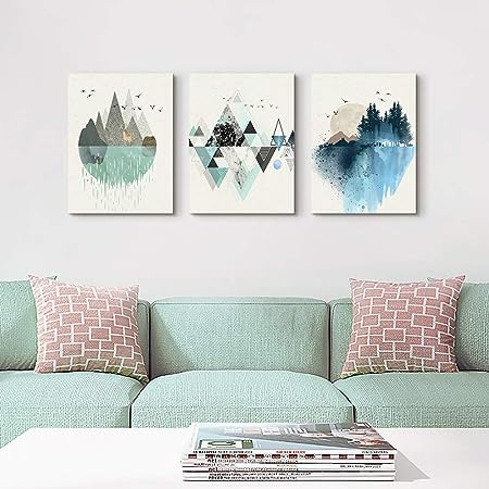
Ideal for enhancing the beauty of your home’s interior walls, this canvas art serves as an excellent choice for spaces like the living room, bedroom, kitchen, bathroom, guest room, and office. The convenience of hanging is assured, as each canvas print panel is skillfully stretched onto sturdy wooden frames, gallery wrapped, equipped with hooks and accompanying accessories, and all set for effortless hanging.
The Size of your Poster Matters Significantly When Making a Selection
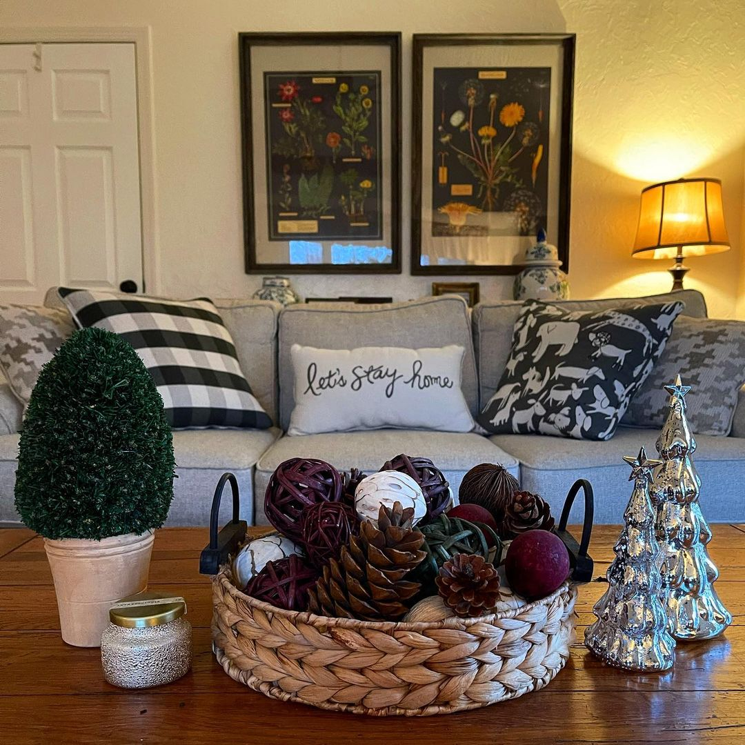
Whether it’s a piece of art, a sculpture, a signboard, or any other object, going for a larger size can have a significant impact on how it is perceived by viewers, allowing it to make a stronger impression and leave a lasting memory. Poster from @ cranerygarden
One common mistake people often make when buying artwork is underestimating the size needed to create a striking visual effect on their walls. Unless you are decorating a small wall space or intend to fill a specific spot in an existing gallery, it’s generally advisable to opt for the next size up from what you initially think you need for a blank wall.
The size that might appear “big” when you measure it up close for your space may not have the same impact when viewed from a distance. Remember, most people will be admiring the artwork from several feet away, not up close. From a distance, even your cherished art piece can appear as small as a postage stamp. In essence, opting for a larger size will enhance its visual appeal and make it look more impressive from a distance!
Create a Color Palette By Selecting 2-3 Colors from your Chosen Wall Art
To achieve a cohesive look for your entire room or any specific area like a cozy corner or reading nook, start by envisioning and noting down your preferred color palette. While you may already have personal color preferences to guide you, sometimes it’s challenging to decide on the colors for your space. In such cases, an effortless approach is to extract 2-3 colors from a piece of artwork (or multiple pieces) that you intend to showcase in that particular area. This method works exceptionally well if your room lacks an established color theme (which is quite common). In fact, a straightforward way to decorate a room is to derive the color palette from a single piece of artwork and then acquire home accessories in complementary colors.
When initially designing a room, many individuals opt for neutral-colored furniture, such as brown, gray, and ivory tones, as they are considered safe and versatile choices. This serves as an excellent foundation because once you determine your desired color palette, you can effortlessly enhance the ambiance of your living space by incorporating a few accent pieces, such as pillows, throw blankets, and other accessories.
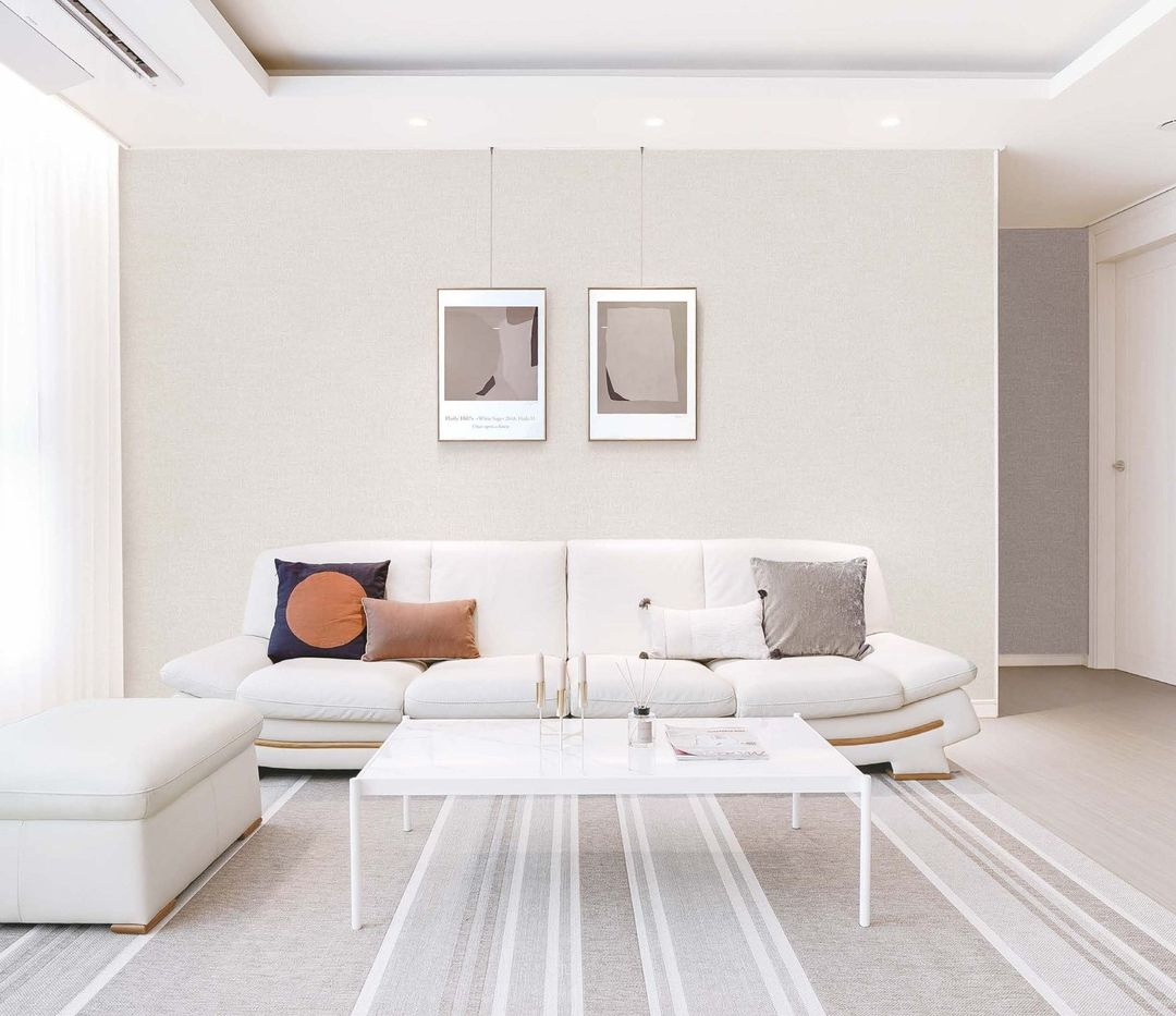
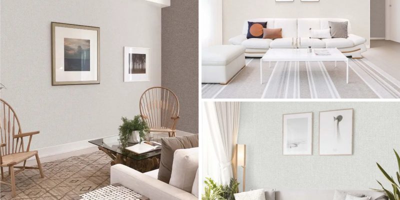
The wall poster perfectly complements the aesthetic of this minimalist living room, adorned with neutral colors. Wall Poster from @ masterpieceinterior
While Concentrating on Color is essential, Remember Not to Overlook Style, Mood, and Theme
While finding complementary colors can be relatively straightforward, determining your preferred style and the desired emotional ambiance you want to evoke when someone enters a room can be more challenging.
Be sure to select the appropriate type of picture frame. A frame that is excessively wide can distract from your art print and potentially diminish its overall appearance. Of course, there are exceptions to this rule. For instance, if your poster has ample negative space around it or if you opt for a frame with a white mat (as illustrated at the bottom of this page), wider frames can work well. However, in most spaces, a thin black frame (as depicted in the photo below) tends to be the most suitable and visually appealing choice.
Looking for inspiration? Take a look at the ideas below!
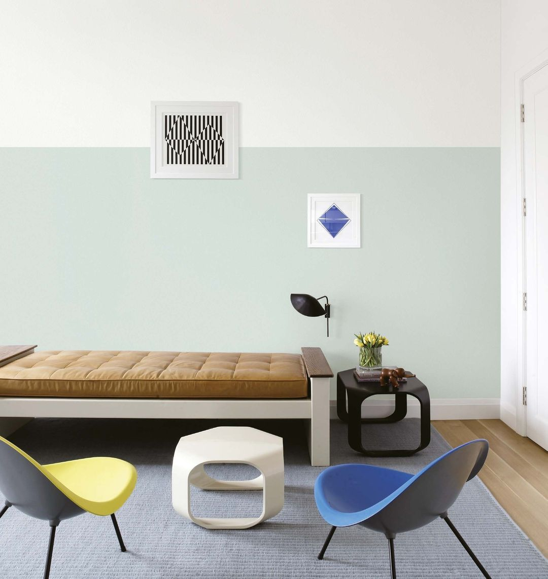
You don’t have to fill your blank wall space with numerous posters. Just hang one or two small ones that can serve as a focal point. The key is to carefully select the posters that can draw attention and become a central focus in the room. Small poster from @ masterpieceinterior
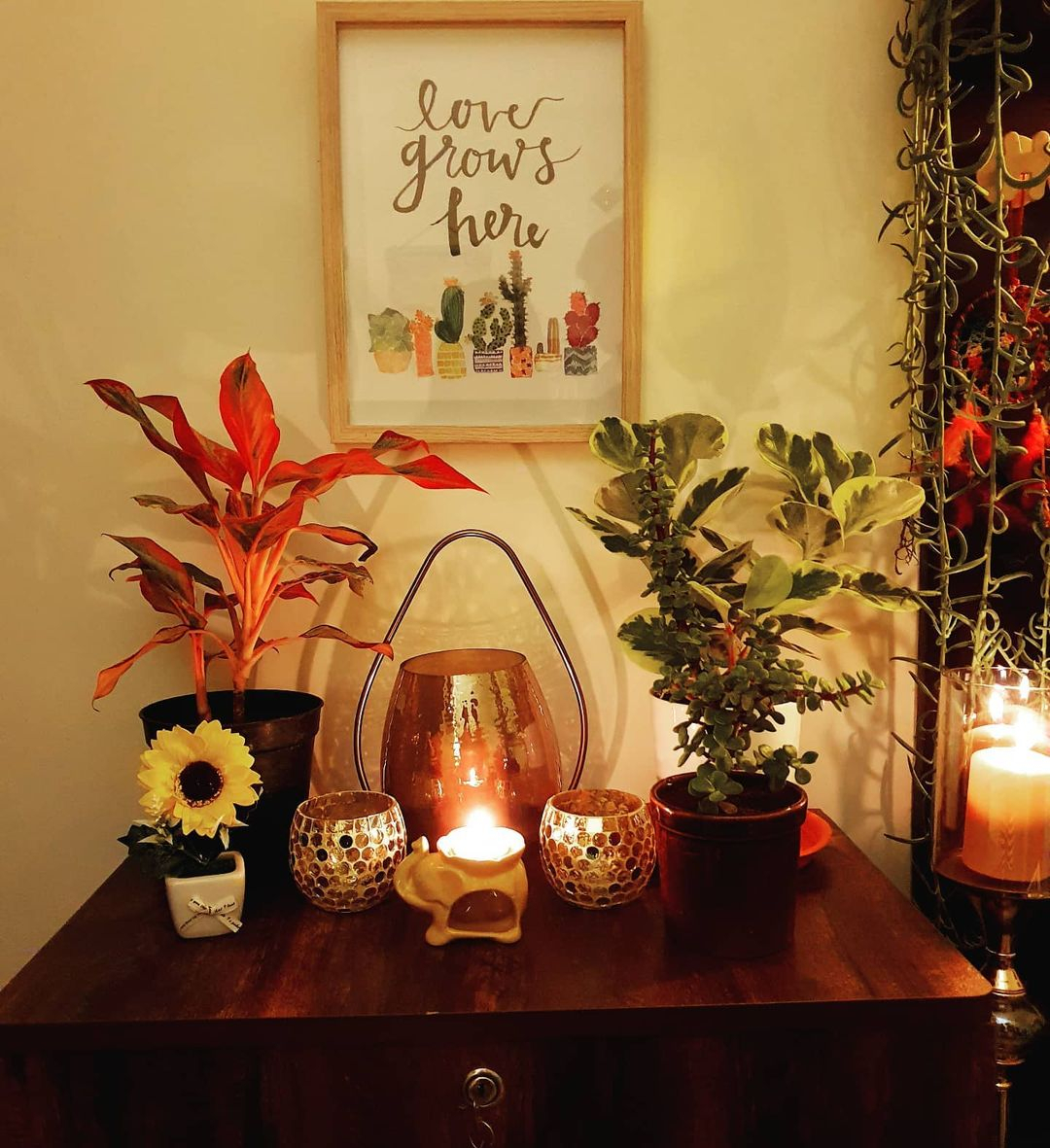
Embracing a green lifestyle is not solely about incorporating live greenery into your space. You can also introduce plant pictures to infuse more color into the room, as shown in the picture above. Go green from @ gardenspace.info
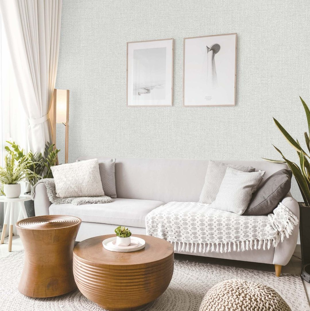
This picture illustrates how choosing the right poster can beautifully complement the overall look of the space. It serves as a reminder not to overlook the elements of style, mood, and theme when decorating your surroundings. Minimalist poster from @ masterpieceinterior
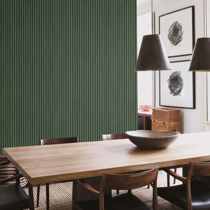
By using colors in the surrounding area, such as on walls, furniture, or decor items, you establish a cohesive and harmonious look. This method ensures that the displayed artworks seamlessly blend with the overall aesthetics of the space, enhancing the visual impact and creating a unified and pleasing environment. Poster from @ masterpieceinterior
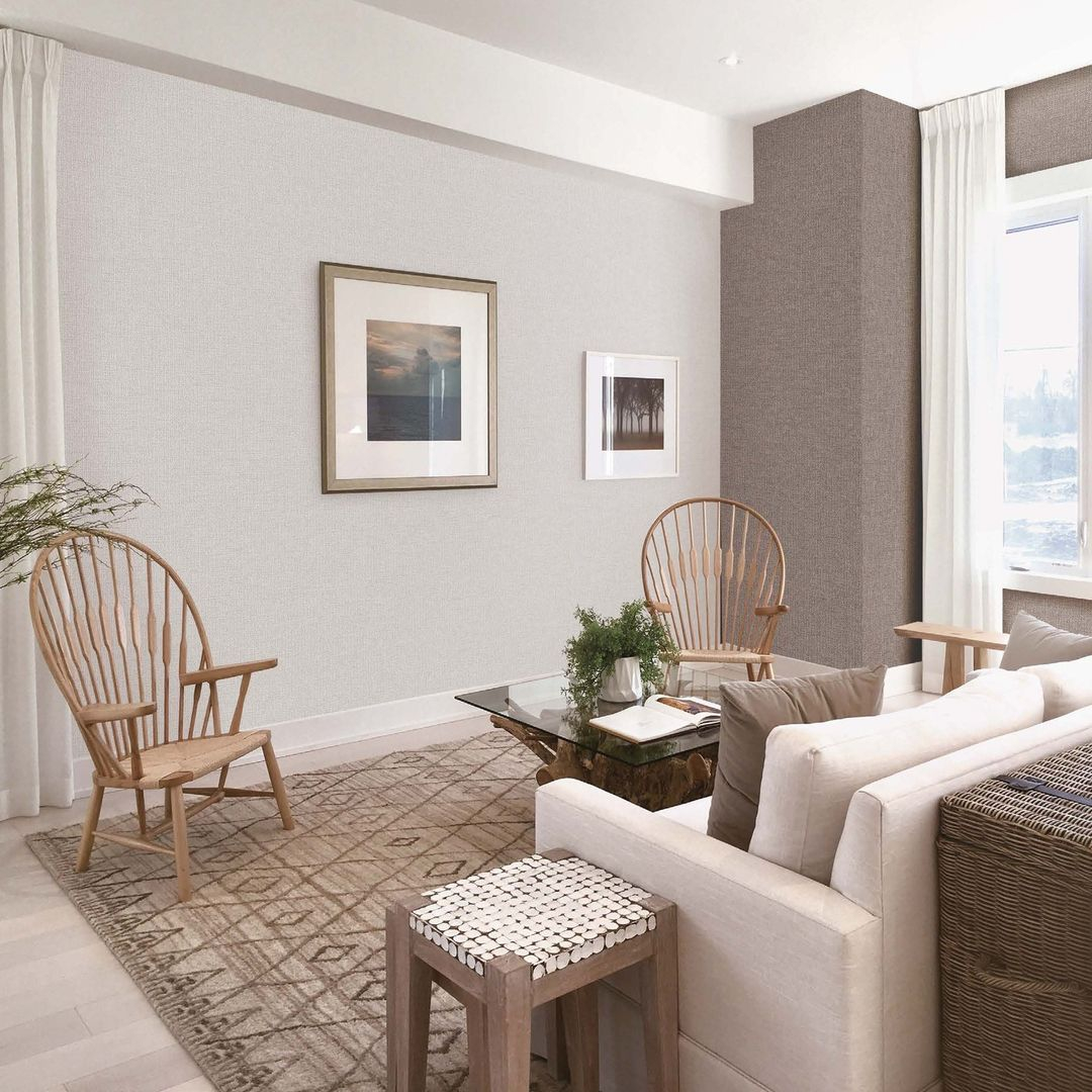
Whether it’s a living room, bedroom, or any other area, a well-curated and balanced design will highlights the showcased artwork while elevating the entire atmosphere. Posters from @ masterpieceinterior


